Spring PR
A rebrand and website for an outdoor PR agency that has spent more than two decades championing other people’s brands.
An evolution, not a revolution.
Overview
Spring PR has represented outdoor and lifestyle brands from Malmesbury since 2000. What began as a website revamp became a full rebrand: an evolved identity, a new Webflow site and the tools for the team to run it themselves.
Outcome
Live since summer 2024. The team runs it themselves, adding case studies, press rooms and news.
Challenge
Spring PR knew Base Camp from ISPO and Kendal Mountain Festival. The brief started as a website, but the identity was showing its age, and this is an agency whose job is making other brands look their best.
The answer was an evolution, not a revolution: modernise the identity and keep what people already recognised.
Role
- A brand alignment workshop with the team.
- Logo, colour, typography and textures, developed over more than nine rounds of concepts.
- Brand guidelines and the full asset suite.
- A set of line illustrations and icons.
- Webflow design and build, with foundational SEO.
- Editor training and a client portal, so the team publish their own case studies, press rooms and news.
- Follow-on work in 2025 on how the agency describes itself.
Approach
The identity is built on a path: a trail motif for the journey Spring takes with its clients. Wood textures carry growth and nature, and black-and-white line illustrations, a camera, a stand of trees, give the site a hand-drawn layer.
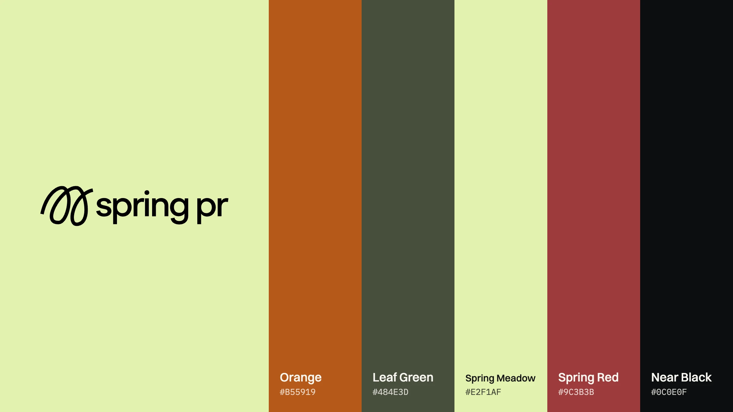
Bookmania sets the headlines and Poppins the text. The palette runs from Orange and Leaf Green to Spring Meadow and Spring Red, signed off by the whole team before anything was built.
The site leads with the agency’s line: “We champion bold brands with purpose.” Behind it sit case studies, services, the agency’s story, a knowledge hub, and press and event rooms for clients such as Leki and AKU.
Identity
The palette in full.
01 — Challenge
Spring PR knew Base Camp from ISPO and Kendal Mountain Festival. The brief started as a website, but the identity was showing its age, and this is an agency whose job is making other brands look their best.
The answer was an evolution, not a revolution: modernise the identity and keep what people already recognised.
02 — Role
- A brand alignment workshop with the team.
- Logo, colour, typography and textures, developed over more than nine rounds of concepts.
- Brand guidelines and the full asset suite.
- A set of line illustrations and icons.
- Webflow design and build, with foundational SEO.
- Editor training and a client portal, so the team publish their own case studies, press rooms and news.
- Follow-on work in 2025 on how the agency describes itself.
03 — Approach
The identity is built on a path: a trail motif for the journey Spring takes with its clients. Wood textures carry growth and nature, and black-and-white line illustrations, a camera, a stand of trees, give the site a hand-drawn layer.
Bookmania sets the headlines and Poppins the text. The palette runs from Orange and Leaf Green to Spring Meadow and Spring Red, signed off by the whole team before anything was built.
The site leads with the agency’s line: “We champion bold brands with purpose.” Behind it sit case studies, services, the agency’s story, a knowledge hub, and press and event rooms for clients such as Leki and AKU.
Identity

04 — Outcome
The site went live in summer 2024 and the team has run it since, adding case studies, press rooms and news themselves. Spring PR still brings its brand questions back to Base Camp.
Credits
Project Description
Spring PR has represented outdoor and lifestyle brands from Malmesbury since 2000. What began as a website revamp became a full rebrand: an evolved identity, a new Webflow site and the tools for the team to run it themselves.
Client
Spring PR — Brand & Website
Date
2024–2025
Services
Brand Strategy / Identity / Guidelines / Website Design / Webflow
Sector
PR / Outdoor & lifestyle
The work. What we did, and what it changed.
Spring PR knew Base Camp from ISPO and Kendal Mountain Festival. The brief started as a website, but the identity was showing its age, and this is an agency whose job is making other brands look their best.
The answer was an evolution, not a revolution: modernise the identity and keep what people already recognised.
- A brand alignment workshop with the team.
- Logo, colour, typography and textures, developed over more than nine rounds of concepts.
- Brand guidelines and the full asset suite.
- A set of line illustrations and icons.
- Webflow design and build, with foundational SEO.
- Editor training and a client portal, so the team publish their own case studies, press rooms and news.
- Follow-on work in 2025 on how the agency describes itself.
The identity is built on a path: a trail motif for the journey Spring takes with its clients. Wood textures carry growth and nature, and black-and-white line illustrations, a camera, a stand of trees, give the site a hand-drawn layer.
Bookmania sets the headlines and Poppins the text. The palette runs from Orange and Leaf Green to Spring Meadow and Spring Red, signed off by the whole team before anything was built.
The site leads with the agency’s line: “We champion bold brands with purpose.” Behind it sit case studies, services, the agency’s story, a knowledge hub, and press and event rooms for clients such as Leki and AKU.
The site went live in summer 2024 and the team has run it since, adding case studies, press rooms and news themselves. Spring PR still brings its brand questions back to Base Camp.
An evolution, not a revolution.
“The work wasn't just about making it look better — it was about building a clearer relationship between product, story and experience.”
Related Work — More from the studio. Selected projects where brand, design, and performance move as one.


Shackleton × Defender — Rally Partnership
Partnership Strategy / Concept / Production / Creative Direction
Shackleton — Made to Move
Campaign Concept / Production / Talent / Creative Direction
Shackleton — The Exploration System
Brand Strategy / Product Strategy / System Design / Creative Direction