
Polish Interior
An evolved identity and a product-led website for a maker of slim-framed steel doors and windows.
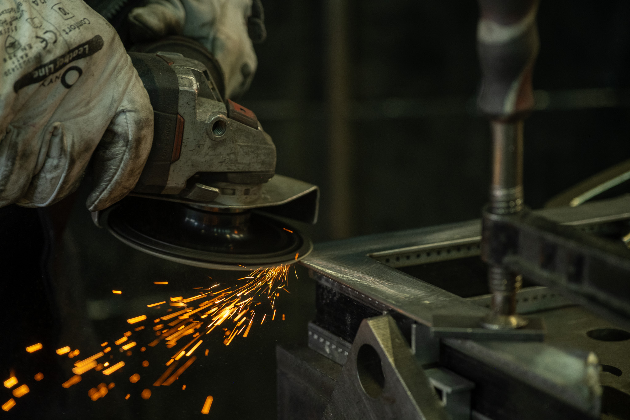
The work was precise. The brand had to be too.
Overview
Polish Interior makes architectural steel doors and windows in its Kraków workshop, for clients across the UK. Base Camp refined the brand into a bilingual identity system and designed a website that works as a product tool for architects and homeowners.
Outcome
Brand delivered in March 2025. The site moved to polishinterior.com that September and has grown with new product pages through 2026.


Challenge
The work was precise; the brand wasn’t. Polish Interior makes slim-framed steel doors and windows to the millimetre, but its identity was traditional and its website out of date, with no finished projects to show a market that buys on detail.
The business was moving from specialist workshop to a name for architectural studios, high-end interiors and clients who notice the detail. The brief was an evolution rather than a restart: keep the name and its heritage, and make both feel as considered as a slim steel frame.
Role
- A discovery workshop and competitor review.
- A refined logo, with English and English–Polish lockups.
- Colour palette, typography and a guideline booklet.
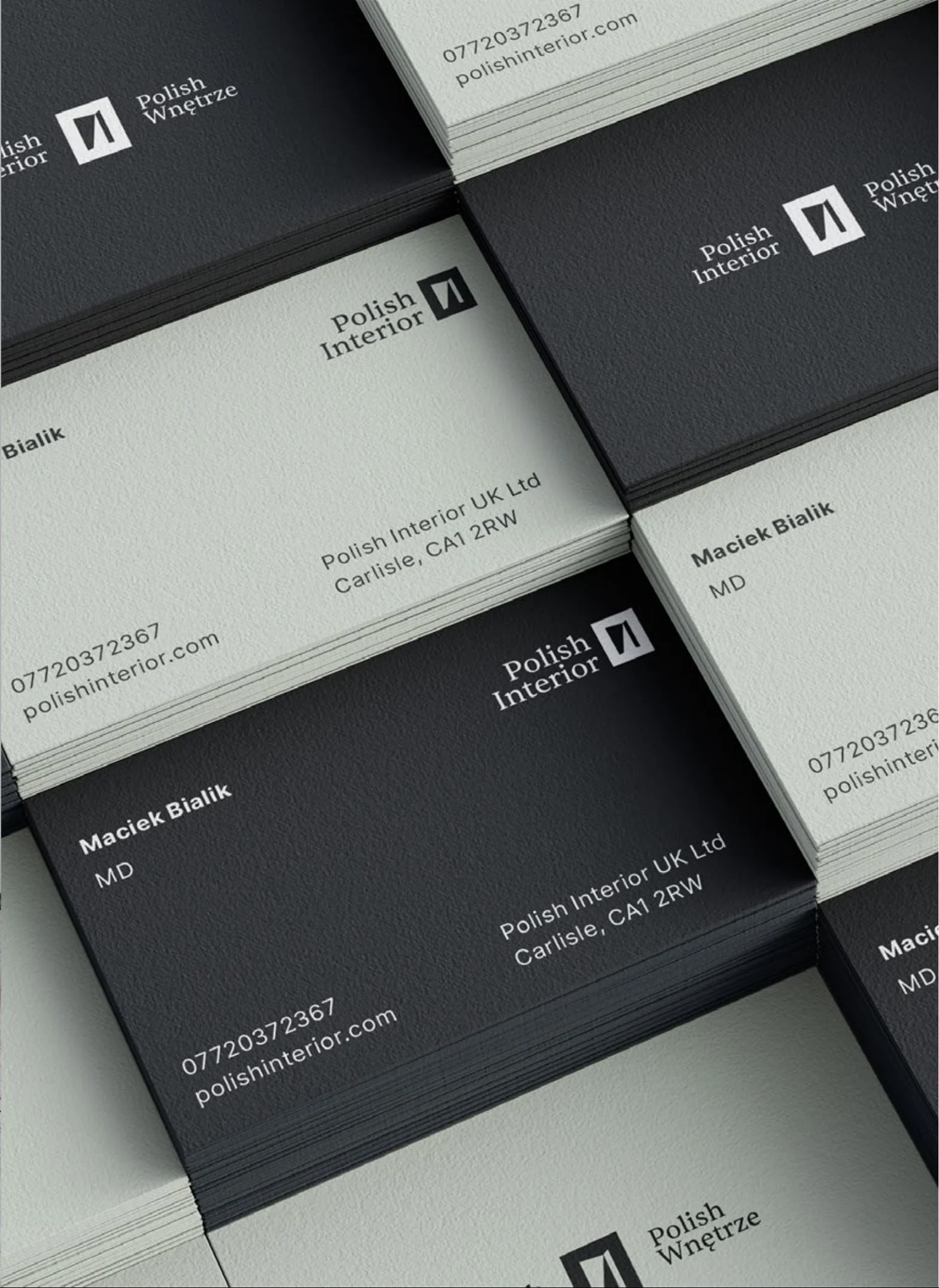
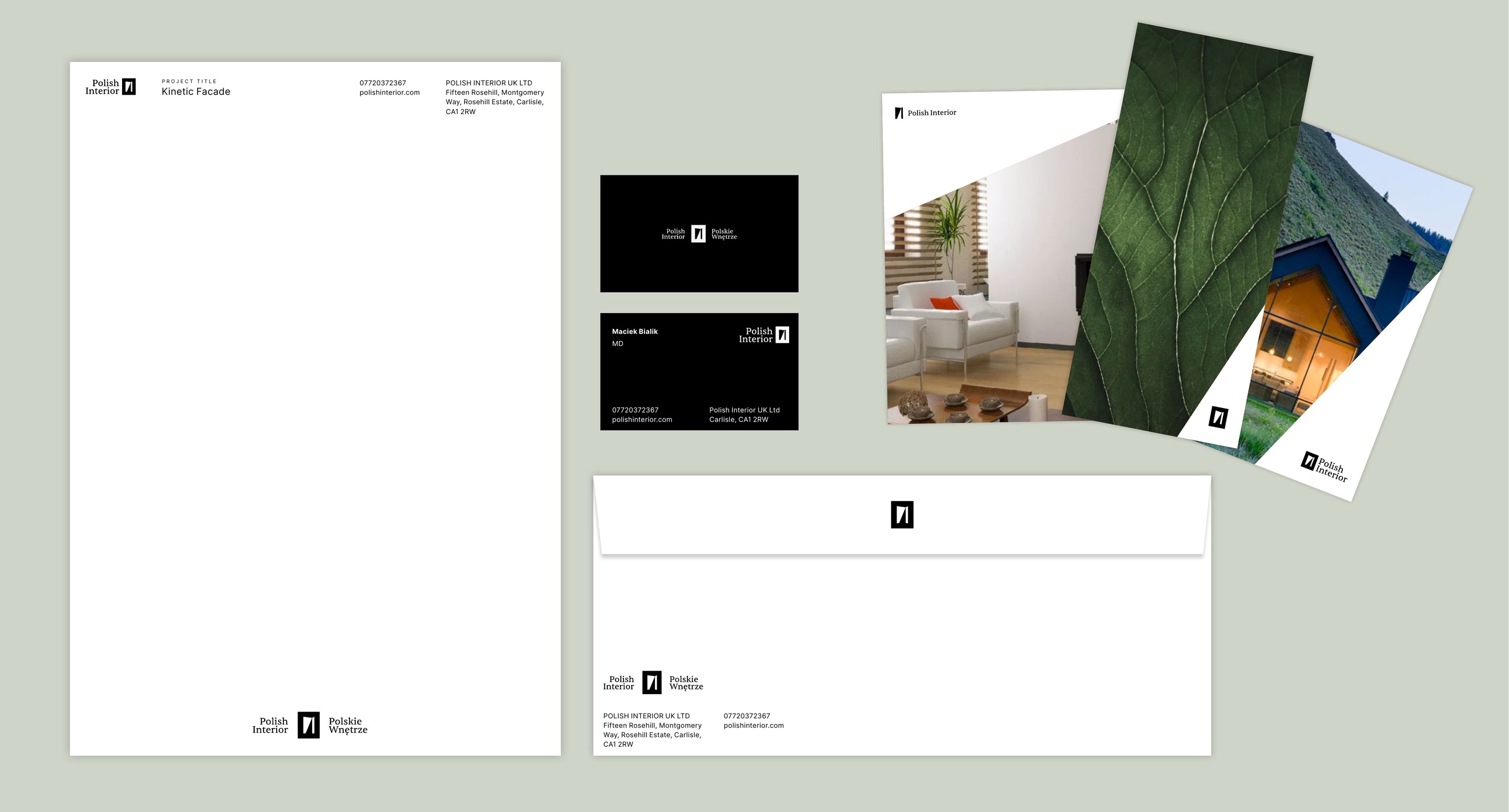
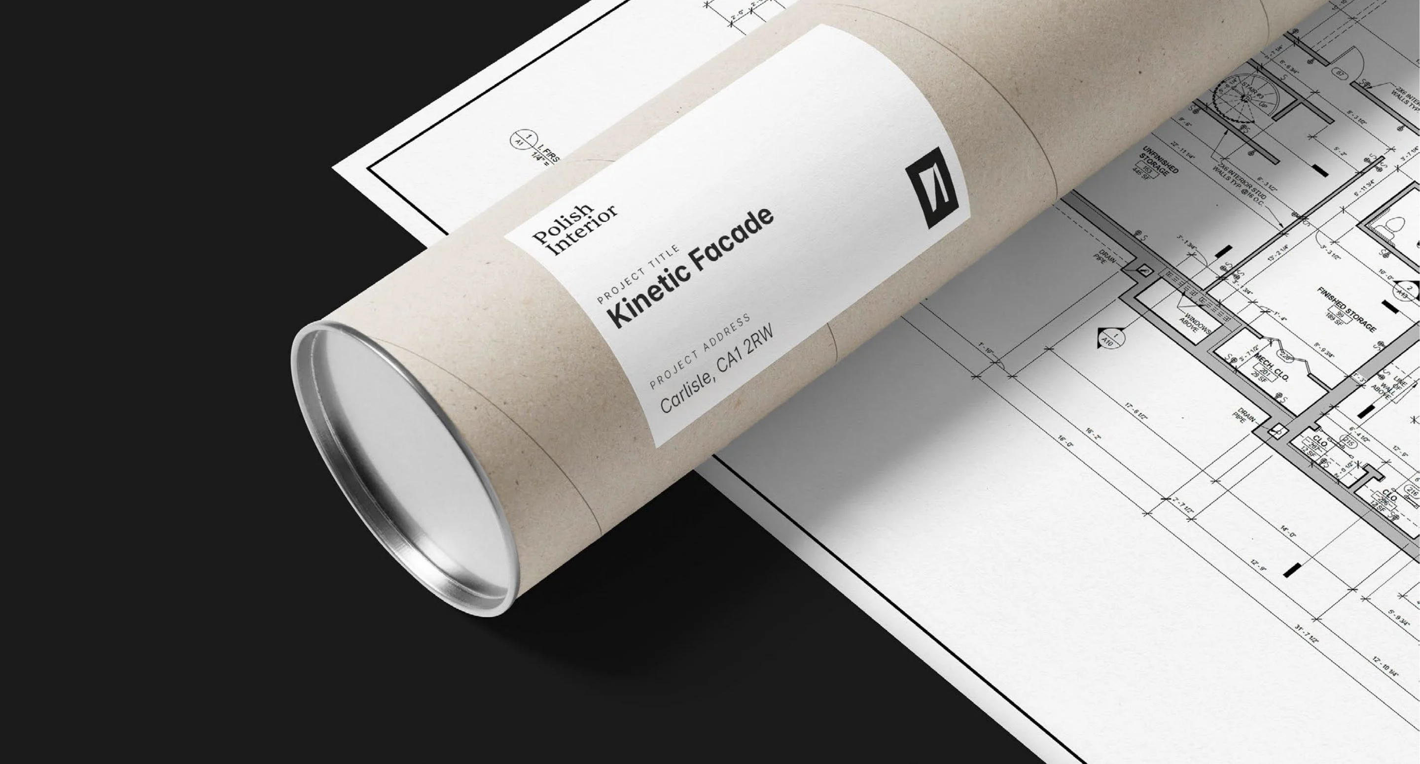
- Business cards printed in white ink on GF Smith Colourplan Ebony by PRINT.WORK in Leeds.
- A print and digital catalogue.
- A film and photography brief.
- Webflow design and build, with a product finder, comparison and technical downloads.
Evolution, not replacement
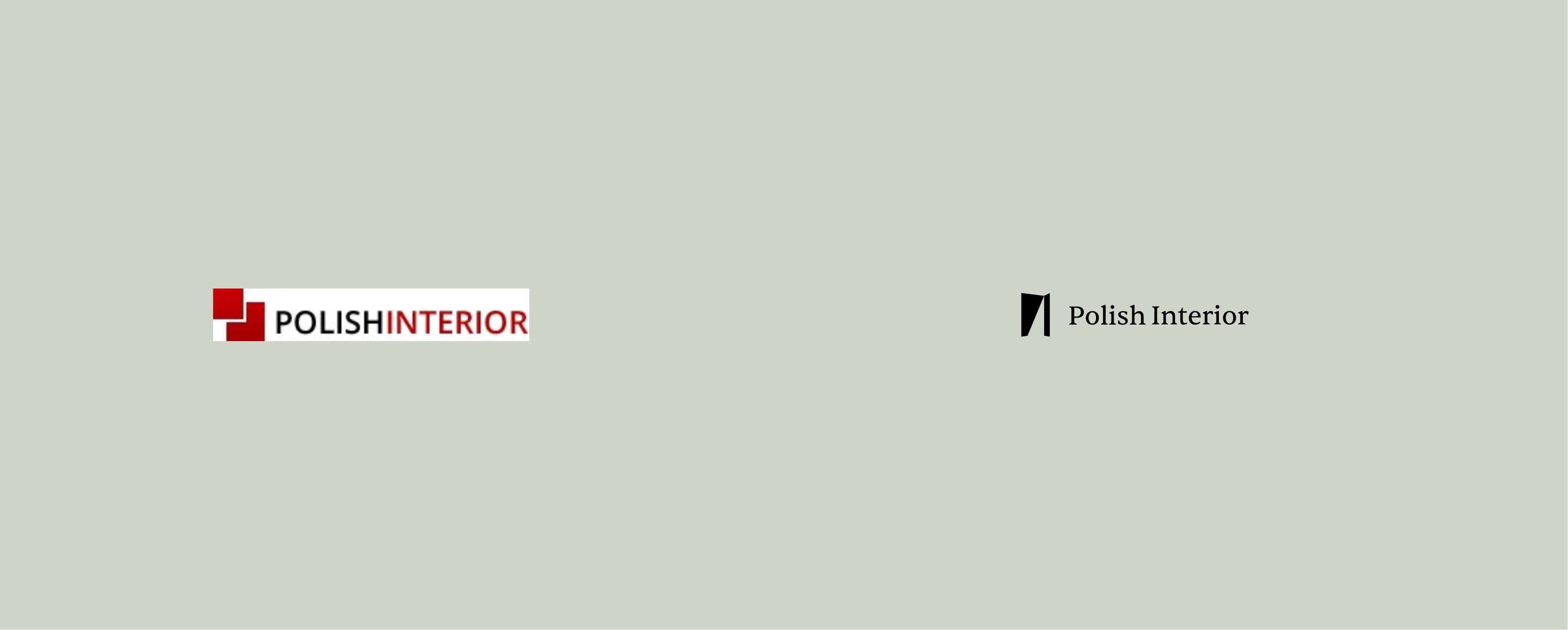
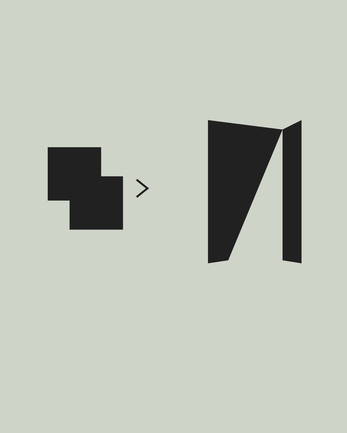
The original logo had done its job: a recognisable presence built over years of work. It was two overlapping red squares and a single-line wordmark. As the brand moved towards architects and high-end interiors, the identity needed to mature with it.
So the new mark keeps what people already knew, the square icon and the single-line name, and makes them architectural.
One mark, six readings
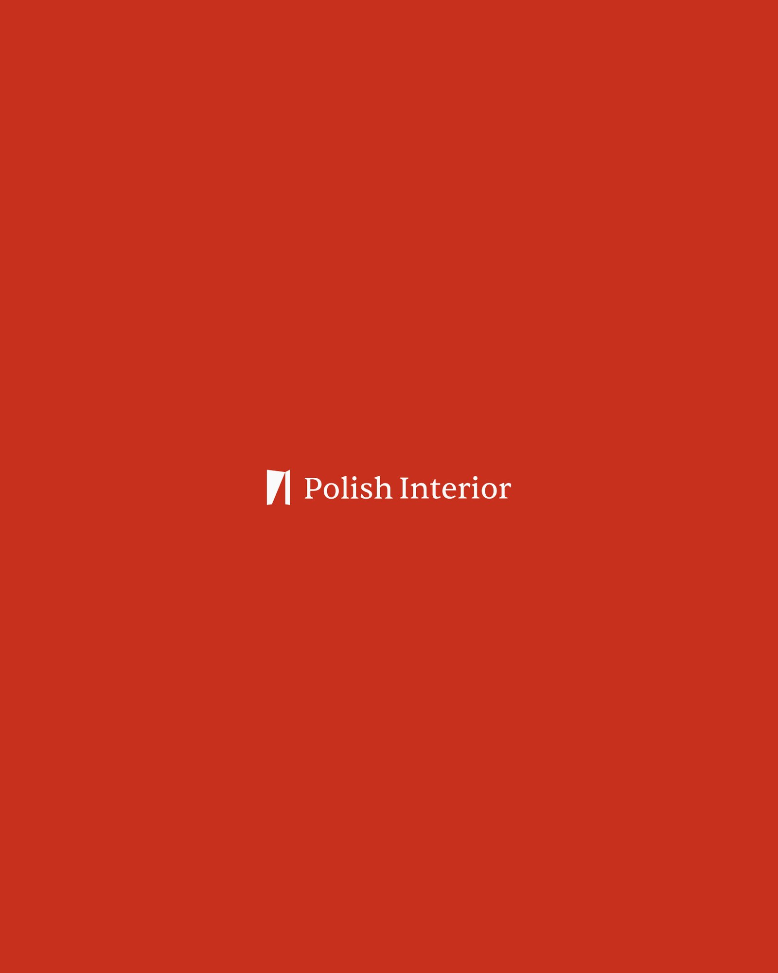
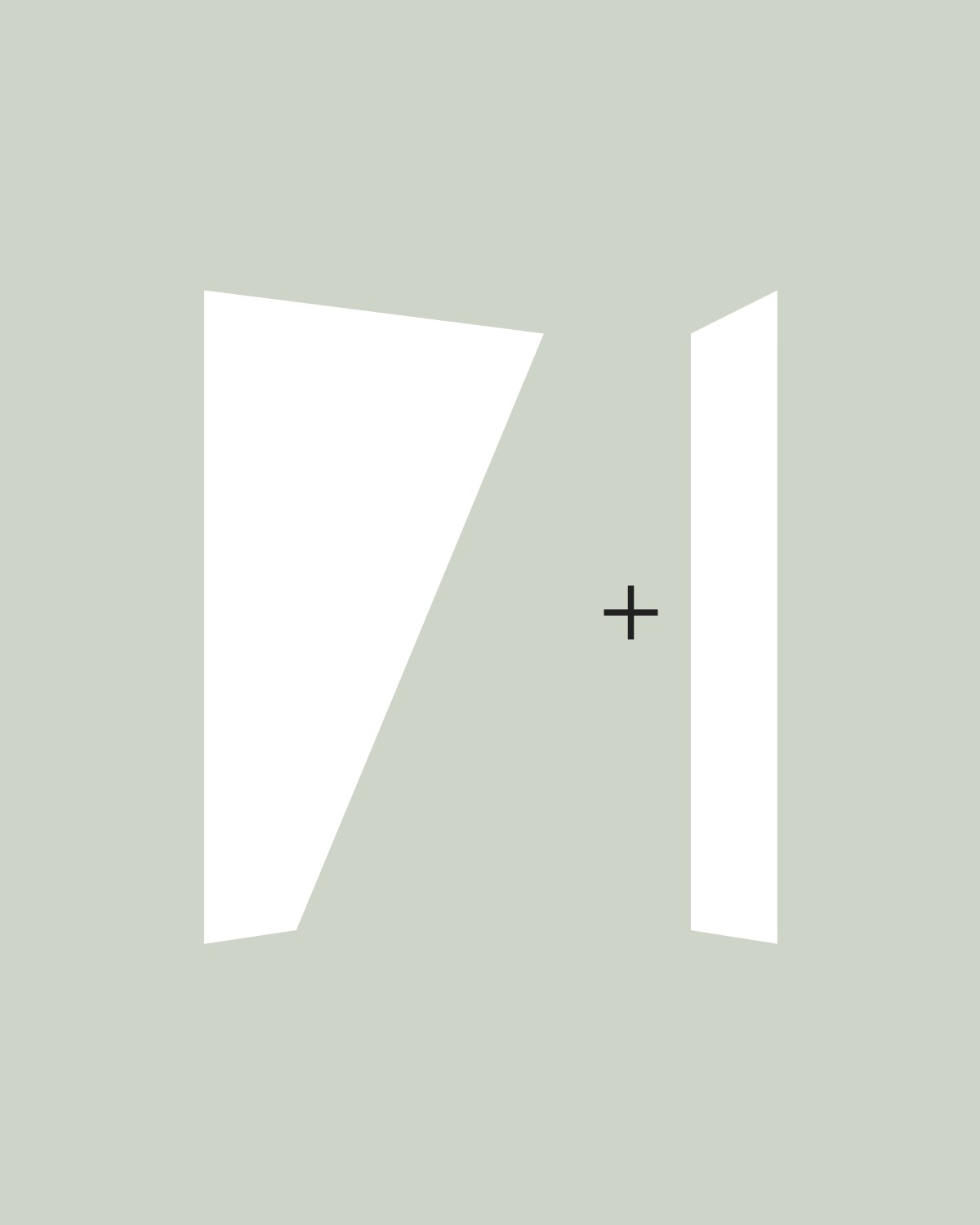
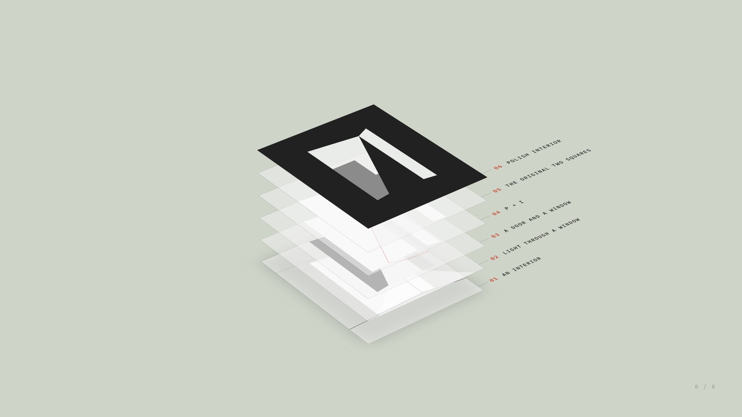
Among the people who know the business best, it has long been “PI”. The mark had to carry that, and it had to say interior without drawing a room. It does both, and more, depending on how you look at it.



The reading, built
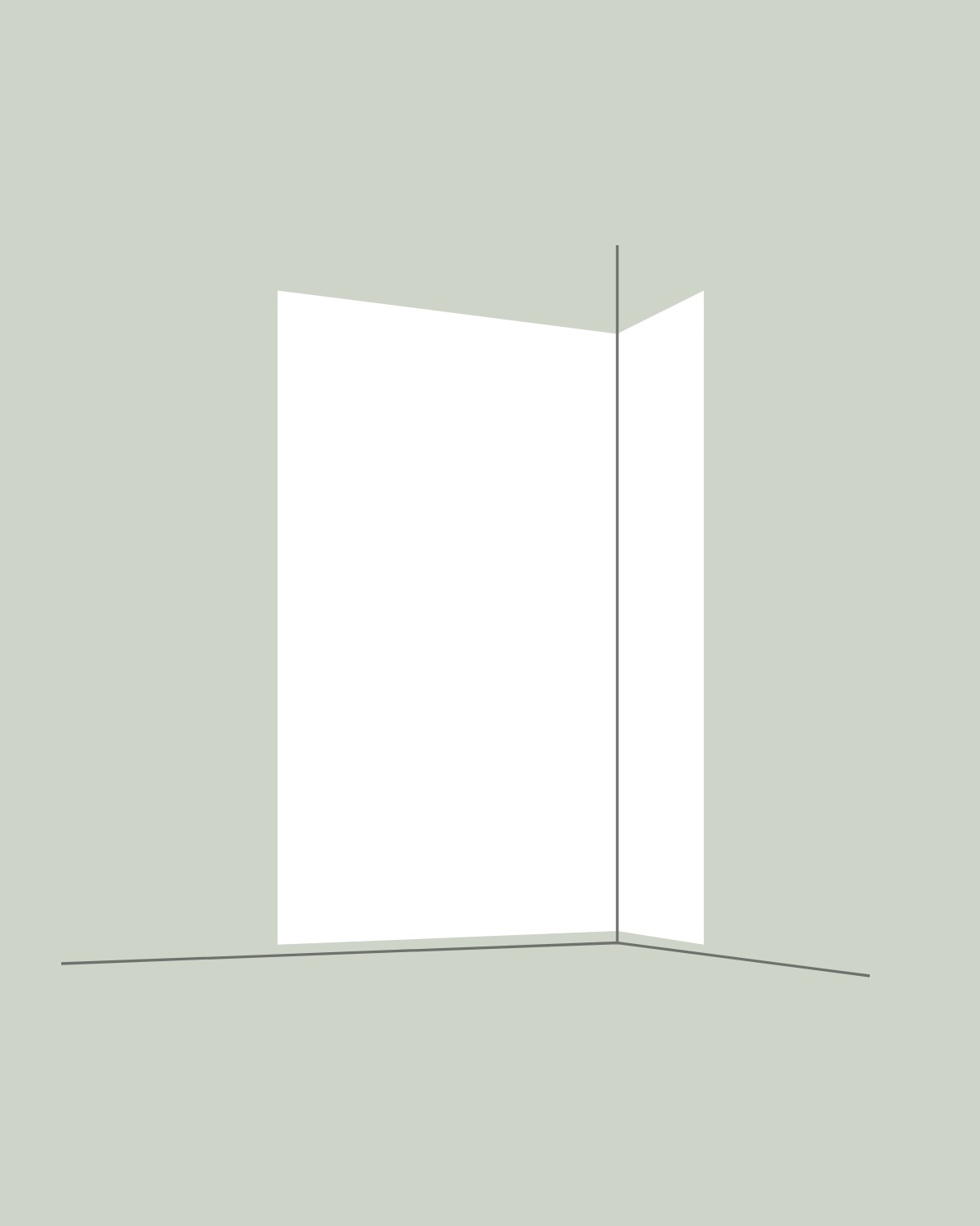
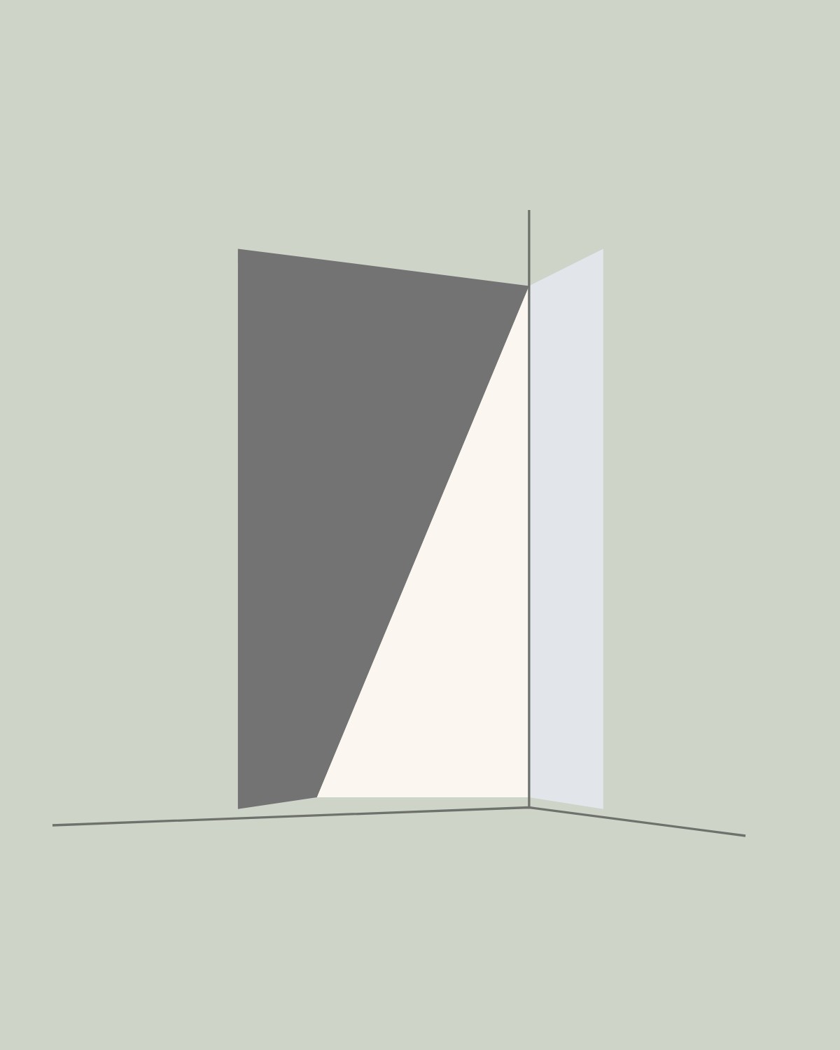
Take the third reading literally and it is a real room. The hinge line is the corner. To its left, a wall in shadow. To its right, a full-height window. The sun through that window lays a wedge of light across the wall, and the three together draw the mark.
The room below is built from the mark’s own perspective: its corner, horizon and sun are worked out from the lines of the logo, so it lines up exactly. Frame it, and the room becomes the mark.
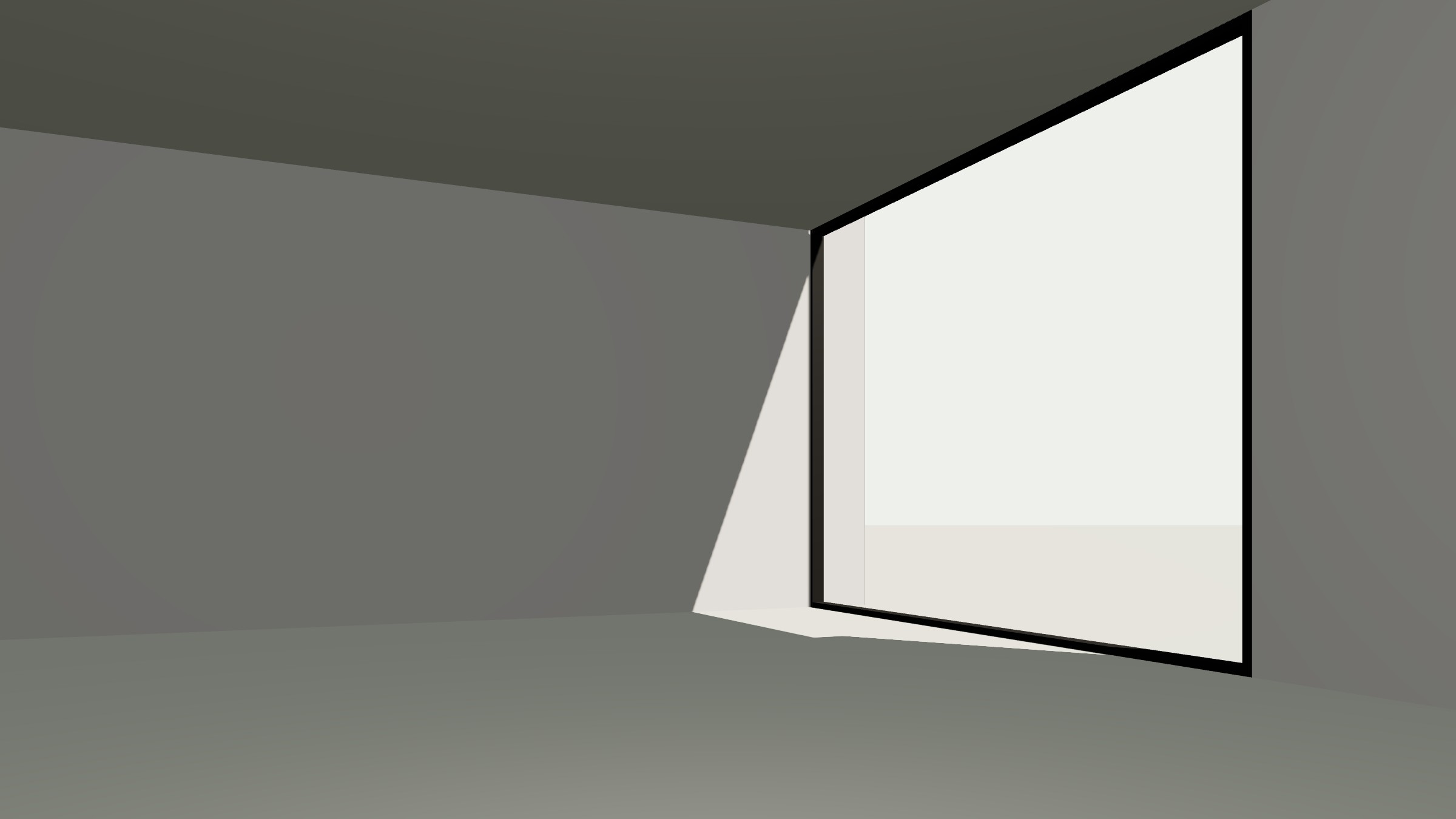

A mark that shifts in meaning depending on how it’s viewed.
Precision
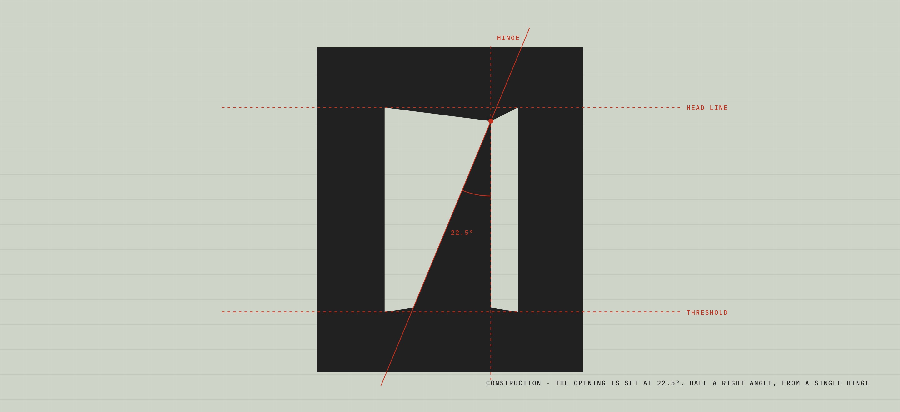
Polish Interior’s clients measure in millimetres, so the mark is built the same way. The opening swings from a single hinge at exactly 22.5°, half a right angle. Its outer corners sit on one head line and one threshold, so the two leaves read as a single opening in a single frame.
Nothing in it is decorative. Every angle is there because a door, a window or a wall would put it there.
Bauhaus, Constructivism, Brutalism
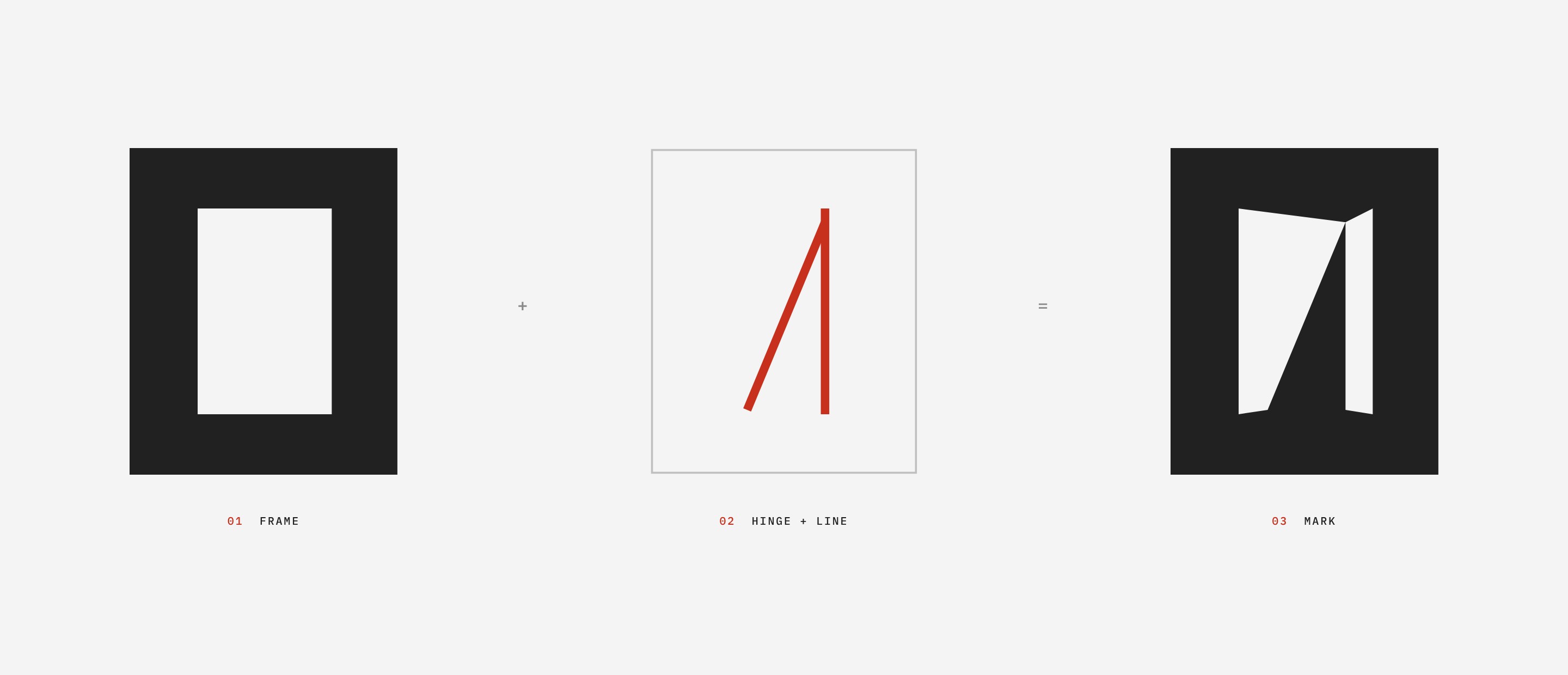
The identity draws on three movements that put function, structure and perception first. From the Bauhaus: negative space, perspective and depth. From Polish Constructivism and its modernist graphics: angular composition and visual tension. From Brutalism: rational, modular thinking.
Reduced to its parts, the mark is a frame and a single line. Everything else is what the eye does with them.
A palette of materials
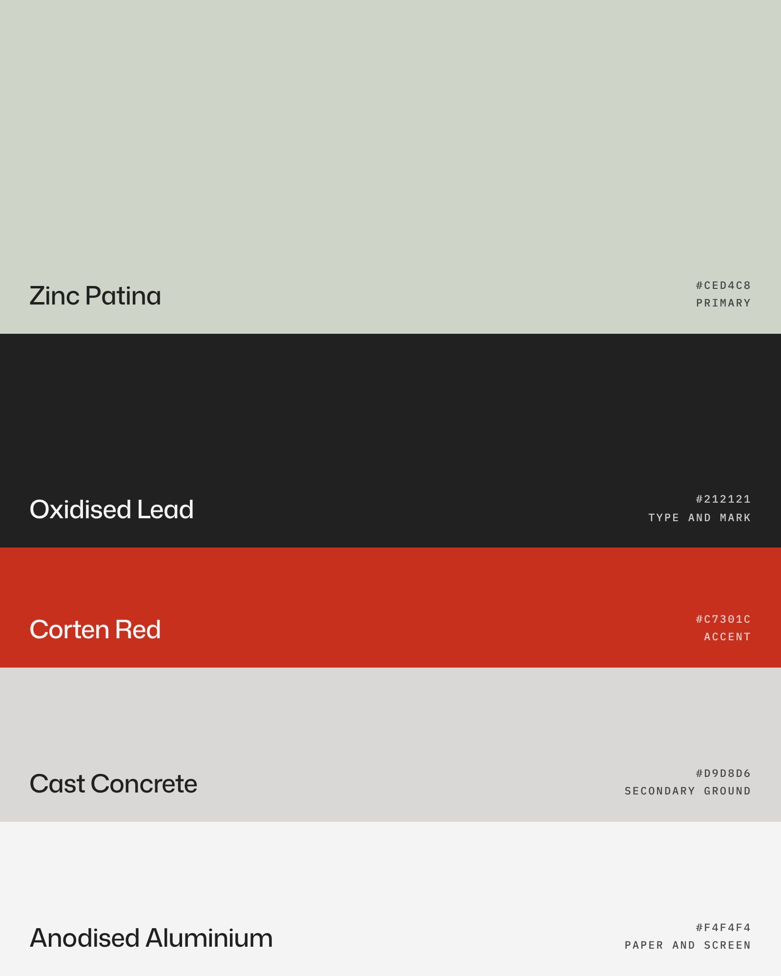
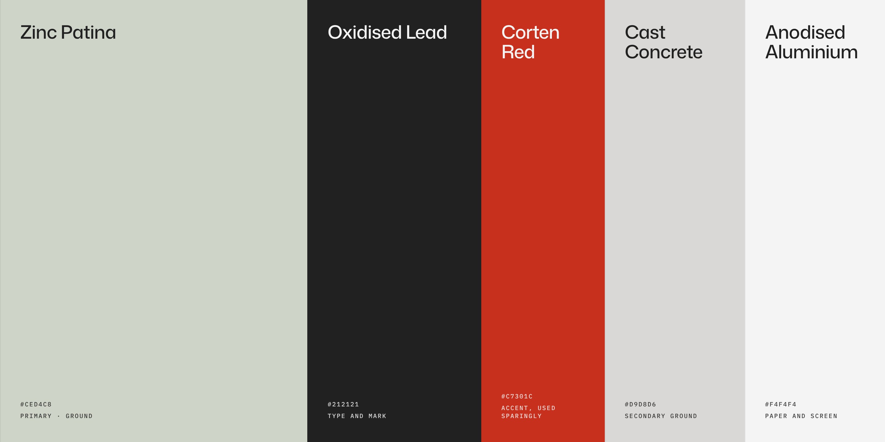
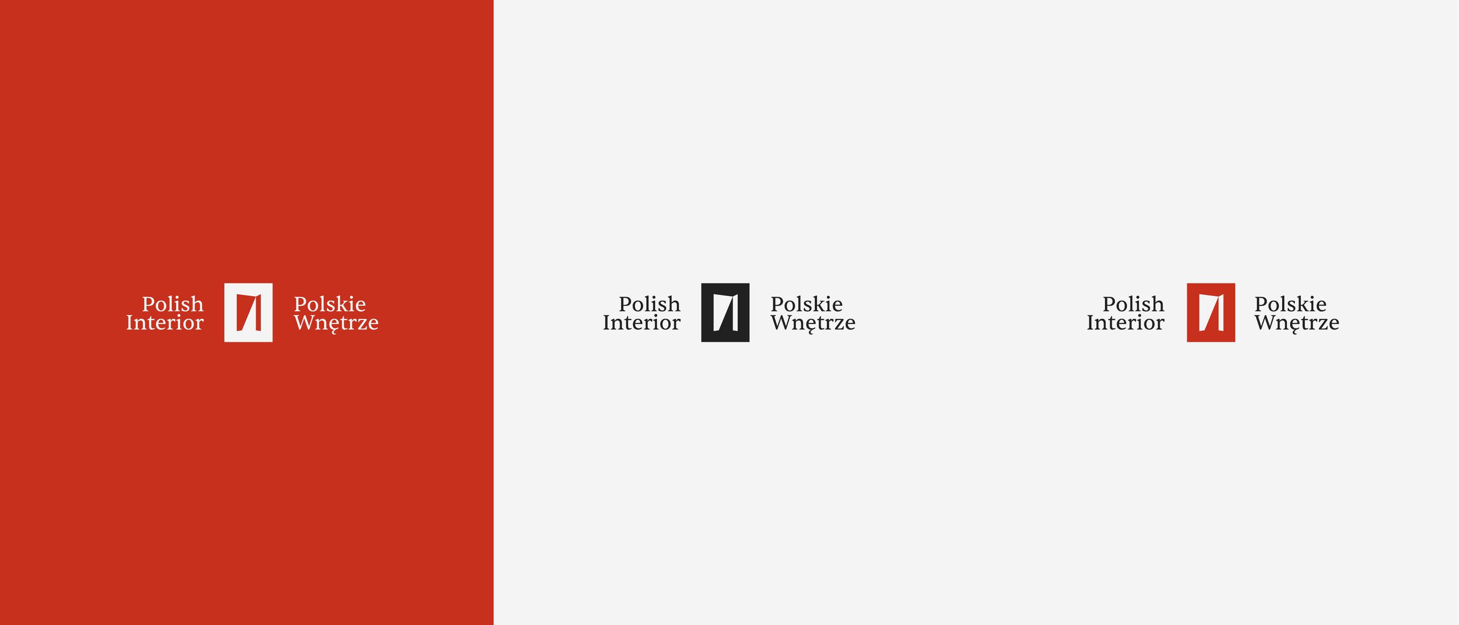
The colours are named for the materials Polish Interior’s work sits among. Zinc Patina leads, Oxidised Lead carries the type and the mark, and Corten Red is used sparingly, as an accent. Cast Concrete and Anodised Aluminium are the grounds for paper and screen.
Two languages
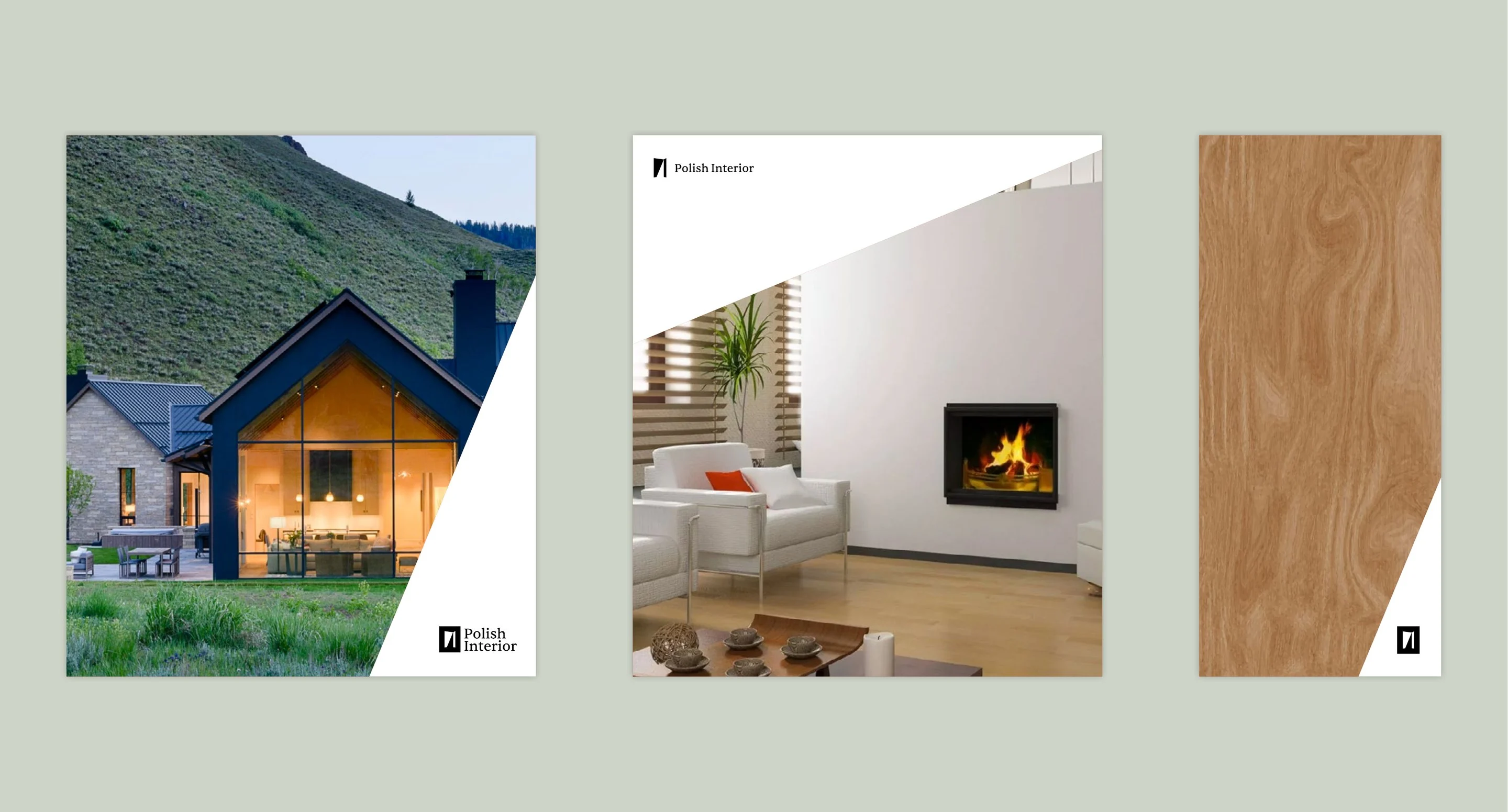
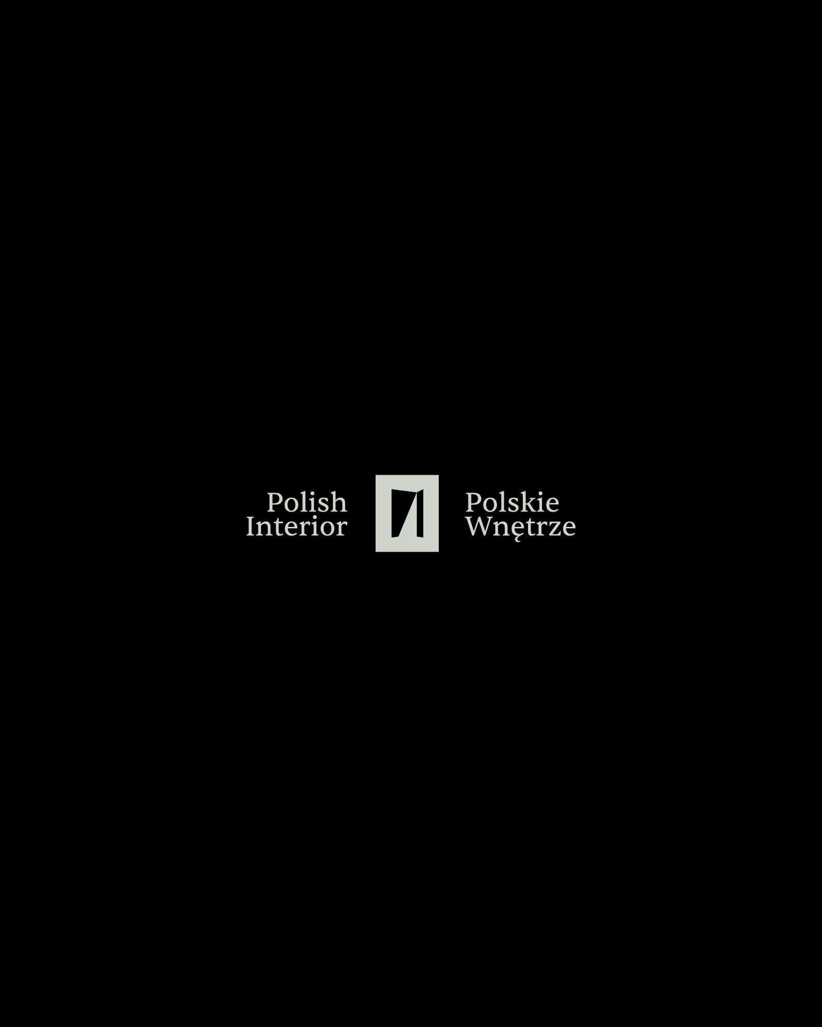
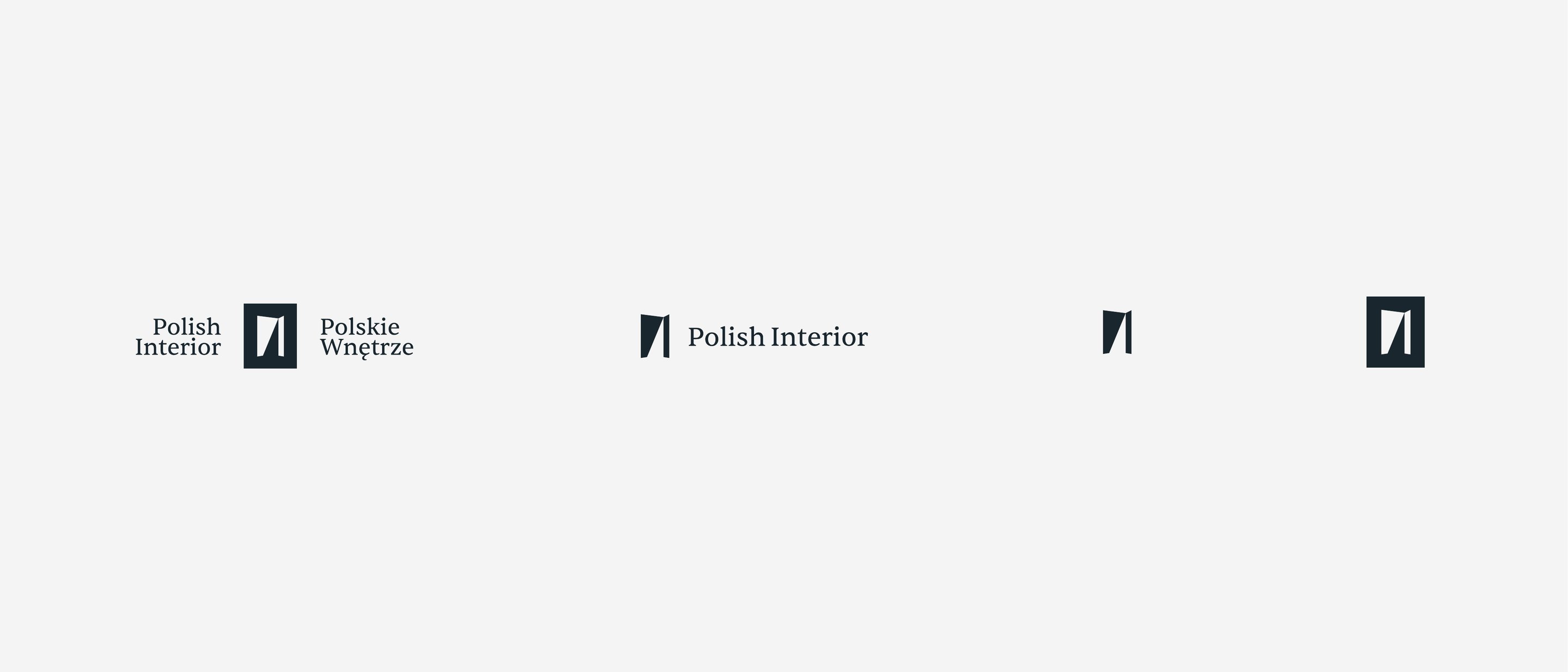
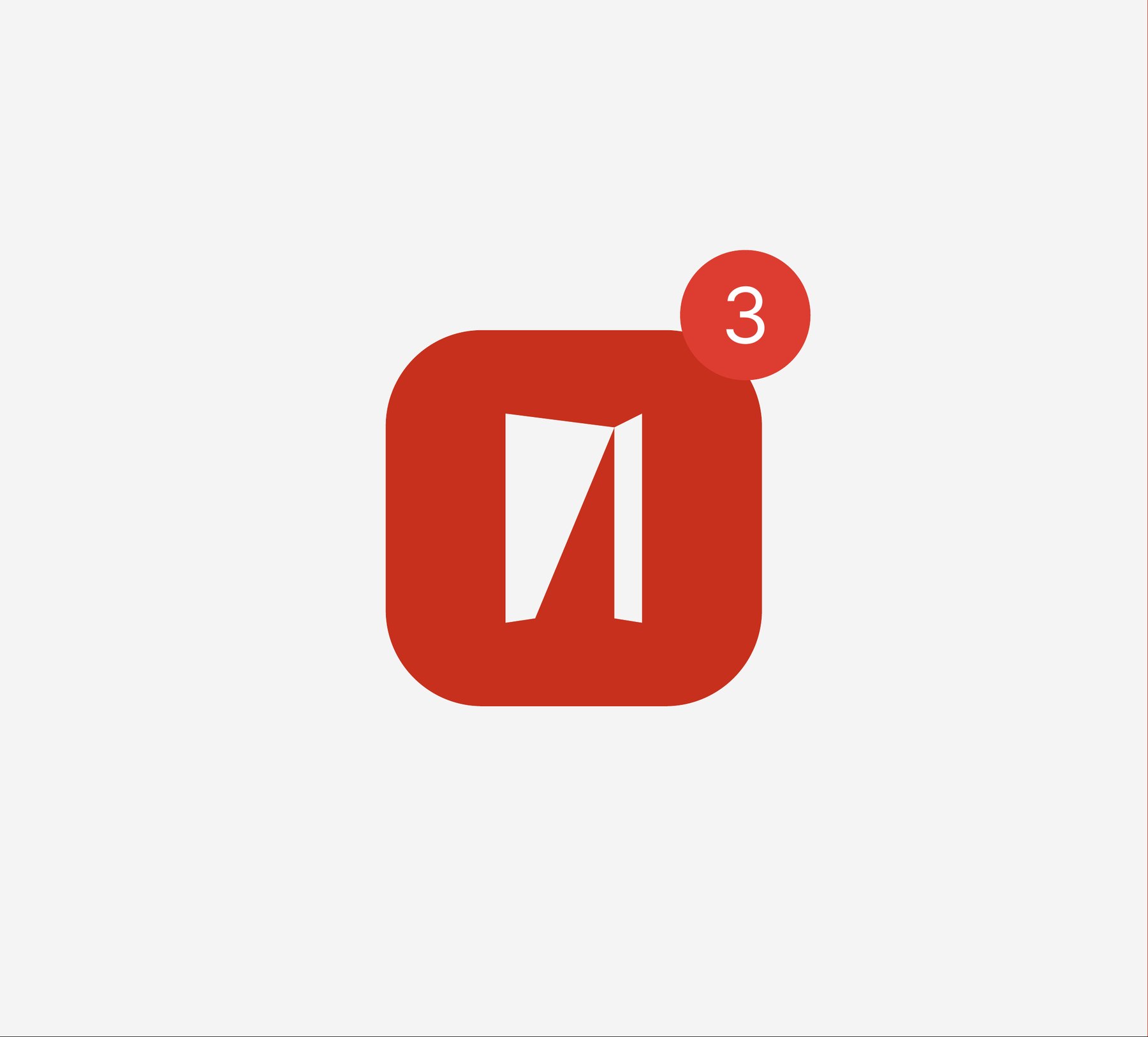
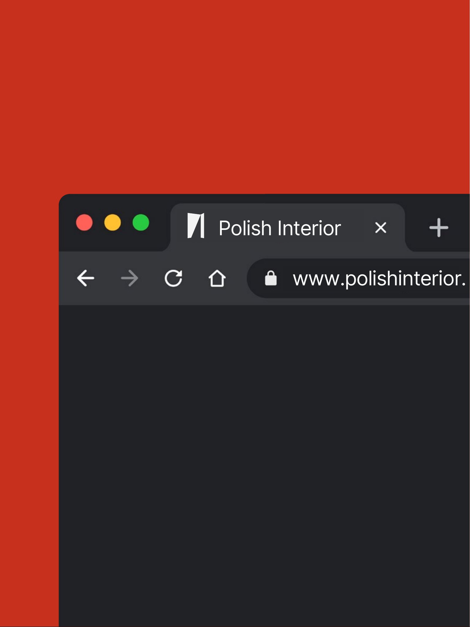
The full lockup sets the mark between Polish Interior and Polskie Wnętrze: a UK business with a Polish workshop, and a name that works in both. A single-line version, the mark alone and a framed app mark cover everything from signage to a browser tab.
Type
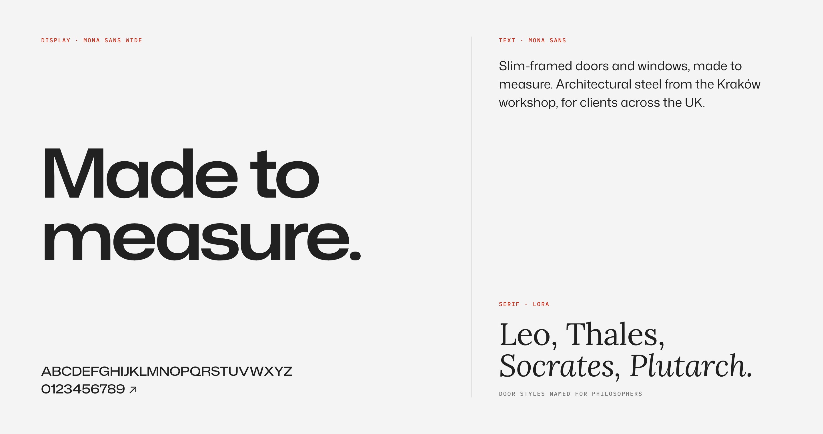
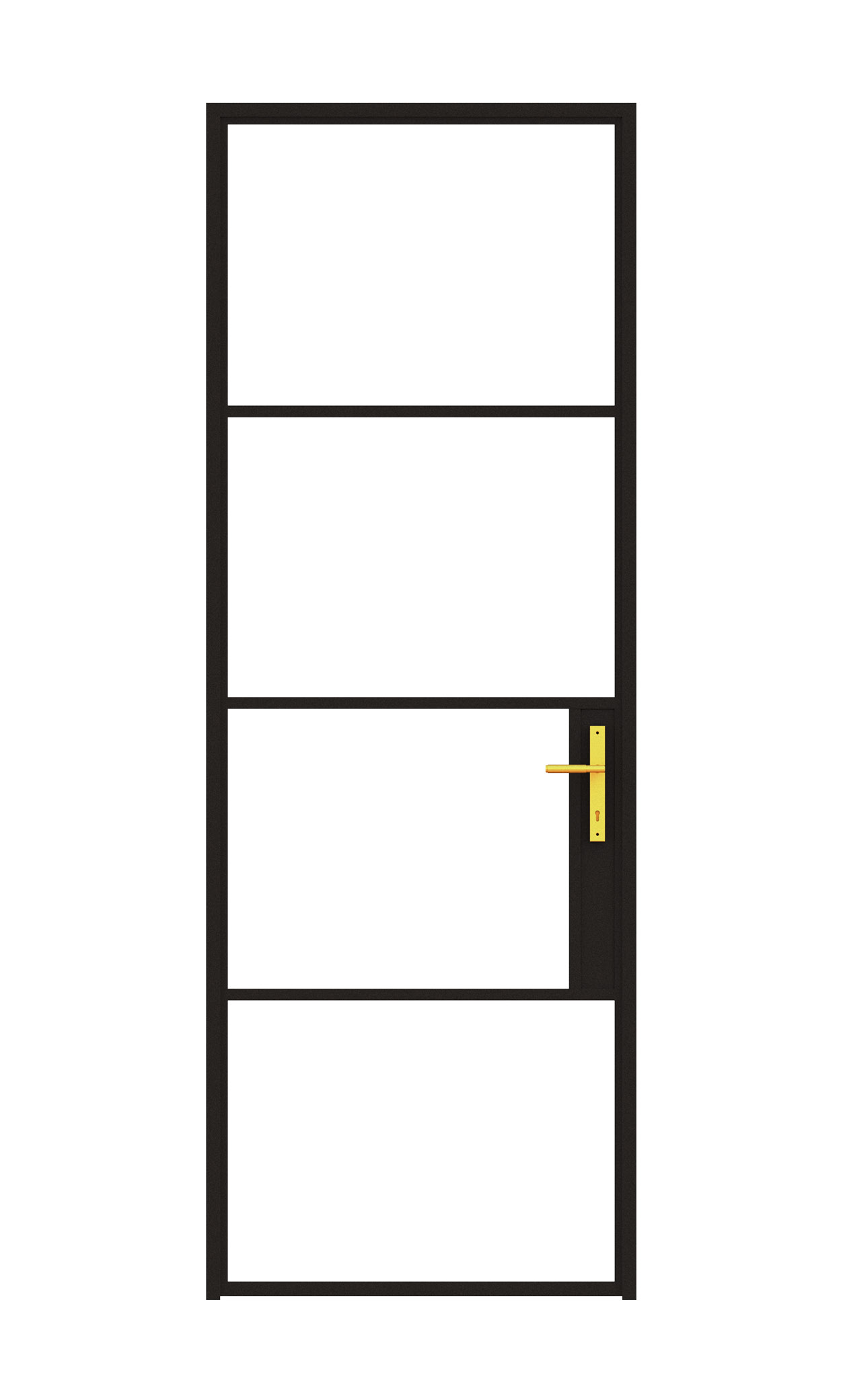
On the website, Mona Sans Wide sets the display lines, Mona Sans carries the text, and Lora adds a serif for names and moments of craft. Door styles take the names of philosophers, from Leo and Thales to Socrates and Plutarch.
Website
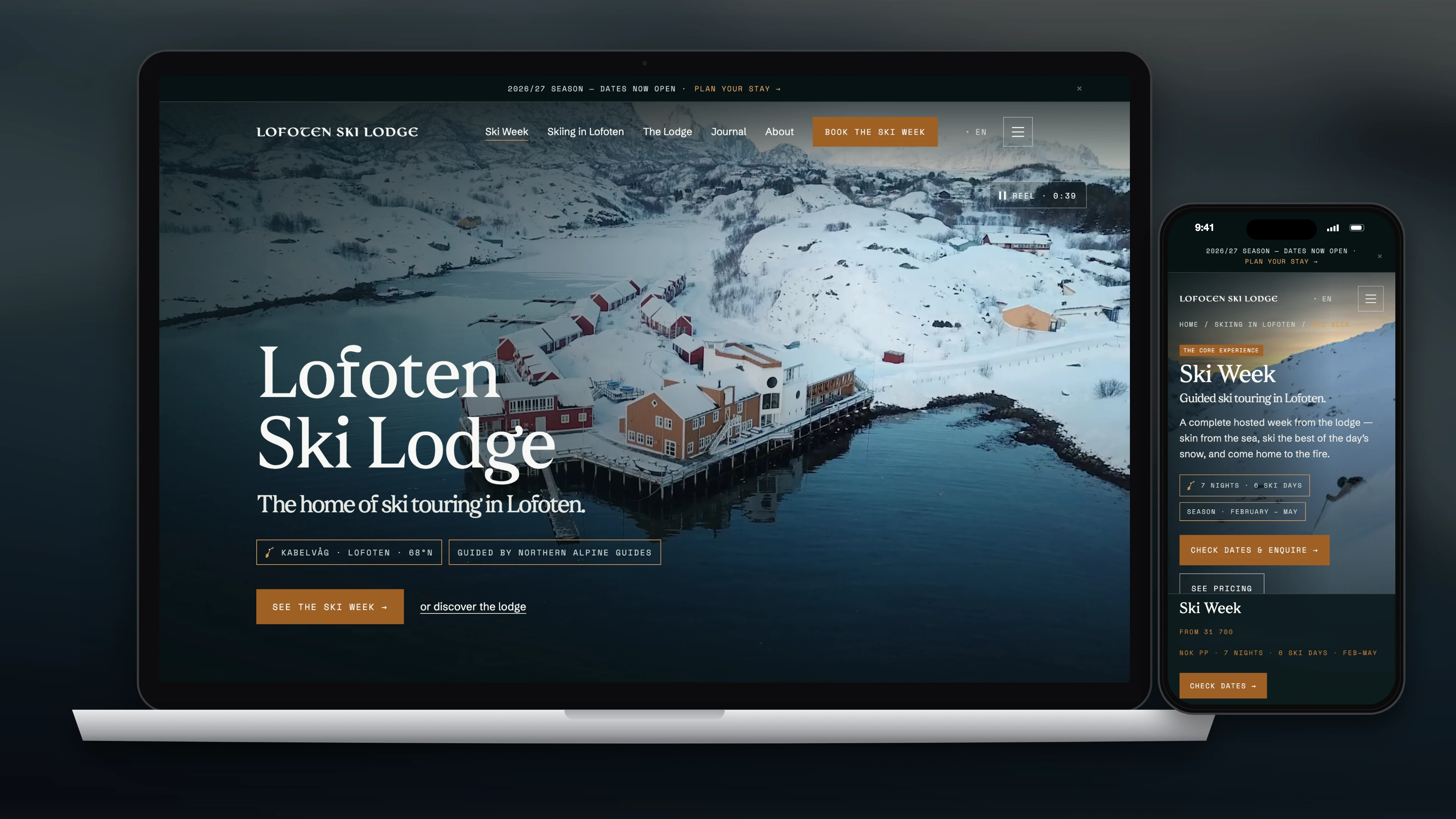
On the site, the products do the talking. The headline is plain: “Slim-framed doors and windows, made to measure.” A product finder, a compare page, drawing review and CAD and test-report downloads give architects what they need without a phone call.
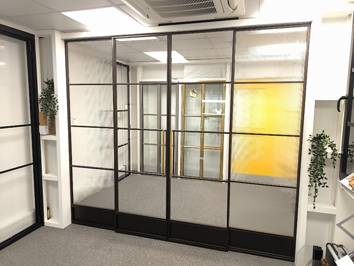
Made in Kraków
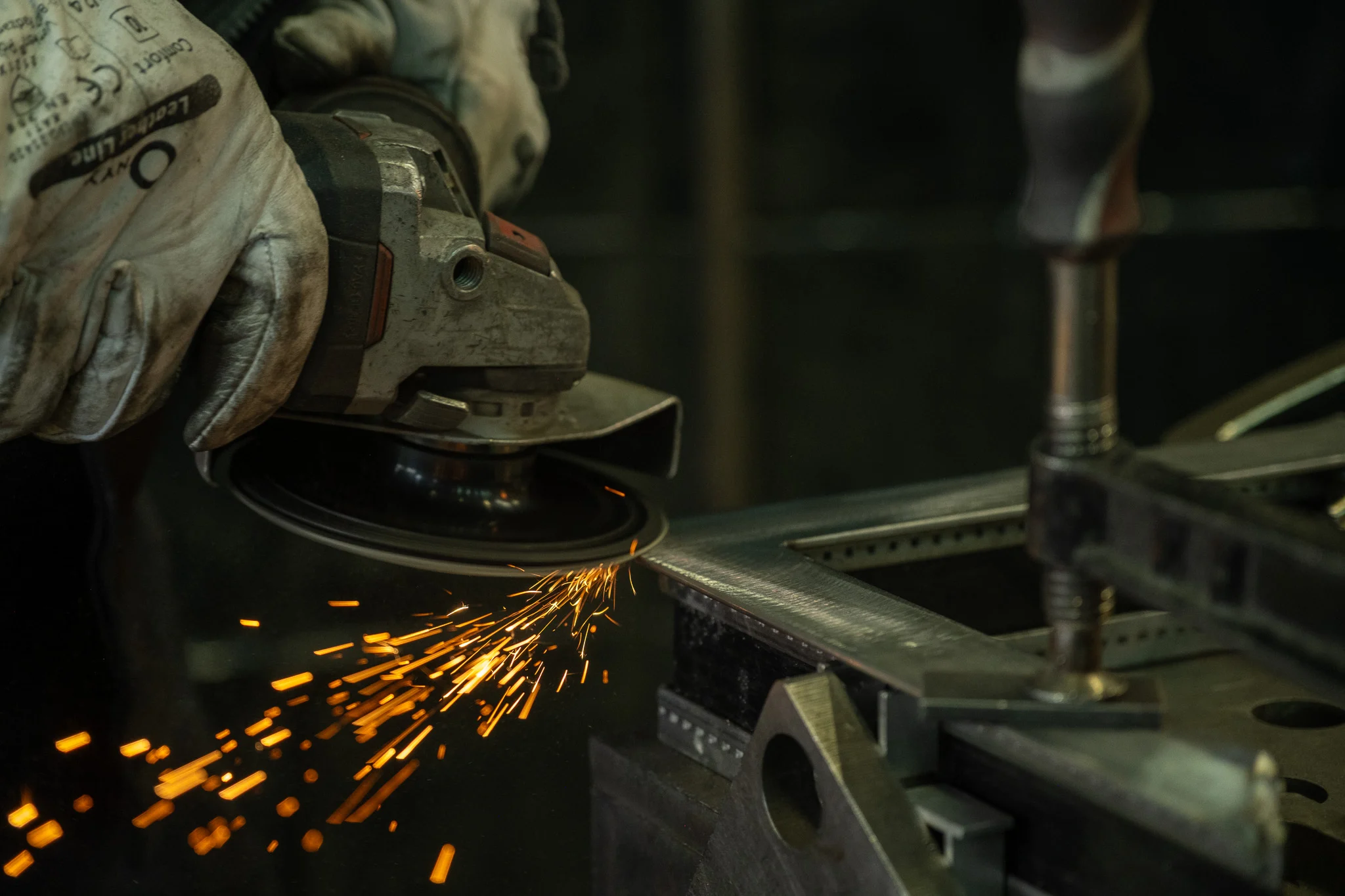
Everything above serves the work itself: architectural steel, cut, welded and finished to the millimetre in the Kraków workshop, then fitted for clients across the UK.

01 — Challenge
The work was precise; the brand wasn’t. Polish Interior’s identity was traditional and its website out of date, with no finished projects to show a market that buys on detail.
The brief was an evolution rather than a restart: keep the name and its heritage, and make both feel as considered as a slim steel frame.
02 — Role
- A discovery workshop and competitor review.
- A refined logo, with English and English–Polish lockups.
- Colour palette, typography and a guideline booklet.
- Business cards printed in white ink on GF Smith Colourplan Ebony by PRINT.WORK in Leeds.
- A print and digital catalogue.
- A film and photography brief.
- Webflow design and build, with a product finder, comparison and technical downloads.
03 — Approach
The logo was refined, not replaced, and set in two languages: Polish Interior and Polskie Wnętrze. The palette is named for materials: Zinc Patina leads, Oxidised Lead carries the type and mark, Corten Red is the accent, with Cast Concrete and Anodised Aluminium as grounds.
On the site, the products do the talking. The headline is plain: “Slim-framed doors and windows, made to measure.” Door styles take the names of philosophers, from Leo and Thales to Socrates and Plutarch. A product finder, a compare page, drawing review and CAD and test-report downloads give architects what they need without a phone call.
Identity


04 — Outcome
The brand assets were delivered in March 2025 and the site moved to polishinterior.com that September, with new product pages added through 2026. The catalogue and cards carry the same system into print.
Credits
Project Description
Polish Interior makes architectural steel doors and windows in its Kraków workshop, for clients across the UK. Base Camp refined the brand into a bilingual identity system and designed a website that works as a product tool for architects and homeowners.
Client
Polish Interior — Brand & Website
Date
2024–2026
Services
Brand Strategy / Identity / Print / Website Design / Webflow
Sector
Architectural doors & windows
The work. What we did, and what it changed.
The work was precise; the brand wasn’t. Polish Interior’s identity was traditional and its website out of date, with no finished projects to show a market that buys on detail.
The brief was an evolution rather than a restart: keep the name and its heritage, and make both feel as considered as a slim steel frame.
- A discovery workshop and competitor review.
- A refined logo, with English and English–Polish lockups.
- Colour palette, typography and a guideline booklet.
- Business cards printed in white ink on GF Smith Colourplan Ebony by PRINT.WORK in Leeds.
- A print and digital catalogue.
- A film and photography brief.
- Webflow design and build, with a product finder, comparison and technical downloads.
The logo was refined, not replaced, and set in two languages: Polish Interior and Polskie Wnętrze. The palette is named for materials: Zinc Patina leads, Oxidised Lead carries the type and mark, Corten Red is the accent, with Cast Concrete and Anodised Aluminium as grounds.
On the site, the products do the talking. The headline is plain: “Slim-framed doors and windows, made to measure.” Door styles take the names of philosophers, from Leo and Thales to Socrates and Plutarch. A product finder, a compare page, drawing review and CAD and test-report downloads give architects what they need without a phone call.
The brand assets were delivered in March 2025 and the site moved to polishinterior.com that September, with new product pages added through 2026. The catalogue and cards carry the same system into print.
The work was precise. The brand had to be too.
“The work wasn't just about making it look better — it was about building a clearer relationship between product, story and experience.”
Related Work — More from the studio. Selected projects where brand, design, and performance move as one.


Shackleton × Defender — Rally Partnership
Partnership Strategy / Concept / Production / Creative Direction
Shackleton — Made to Move
Campaign Concept / Production / Talent / Creative Direction

Shackleton — The Exploration System
Brand Strategy / Product Strategy / System Design / Creative Direction