Glo Fenestration
A new name, identity and website for a window and door studio in the American West.
A studio, not a supplier.
Overview
Glo designs and fabricates European window and door systems in the USA for high-end homes. Working with Expedition Studios, Base Camp took the business from Glo Windows & Doors to Glo Fenestration: a new name, an identity found over three rounds, a 70-page brand guide and the website.
Outcome
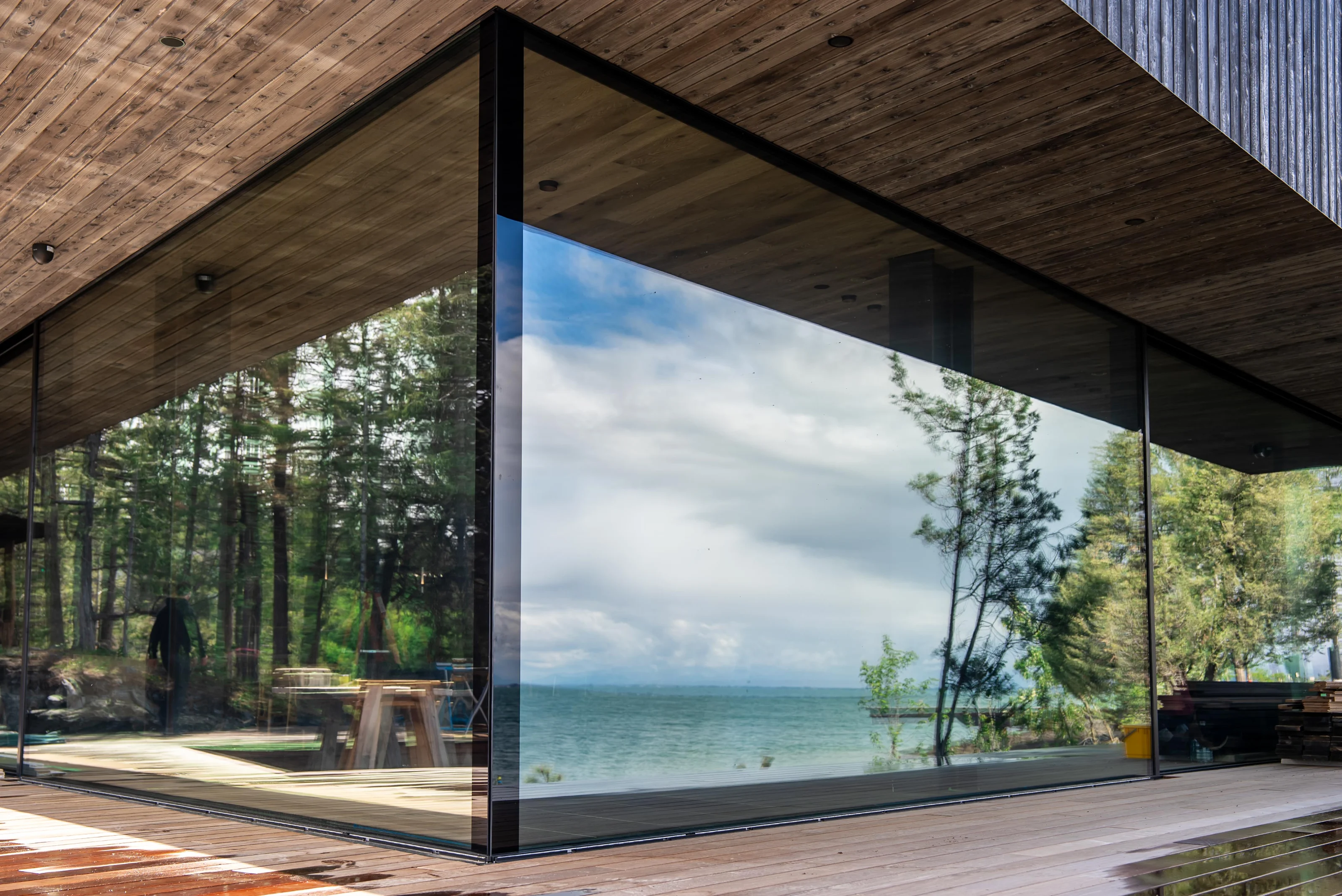
The brand runs from the website to the etching on the glass. Glo also introduced Polish Interior to Base Camp.
Challenge
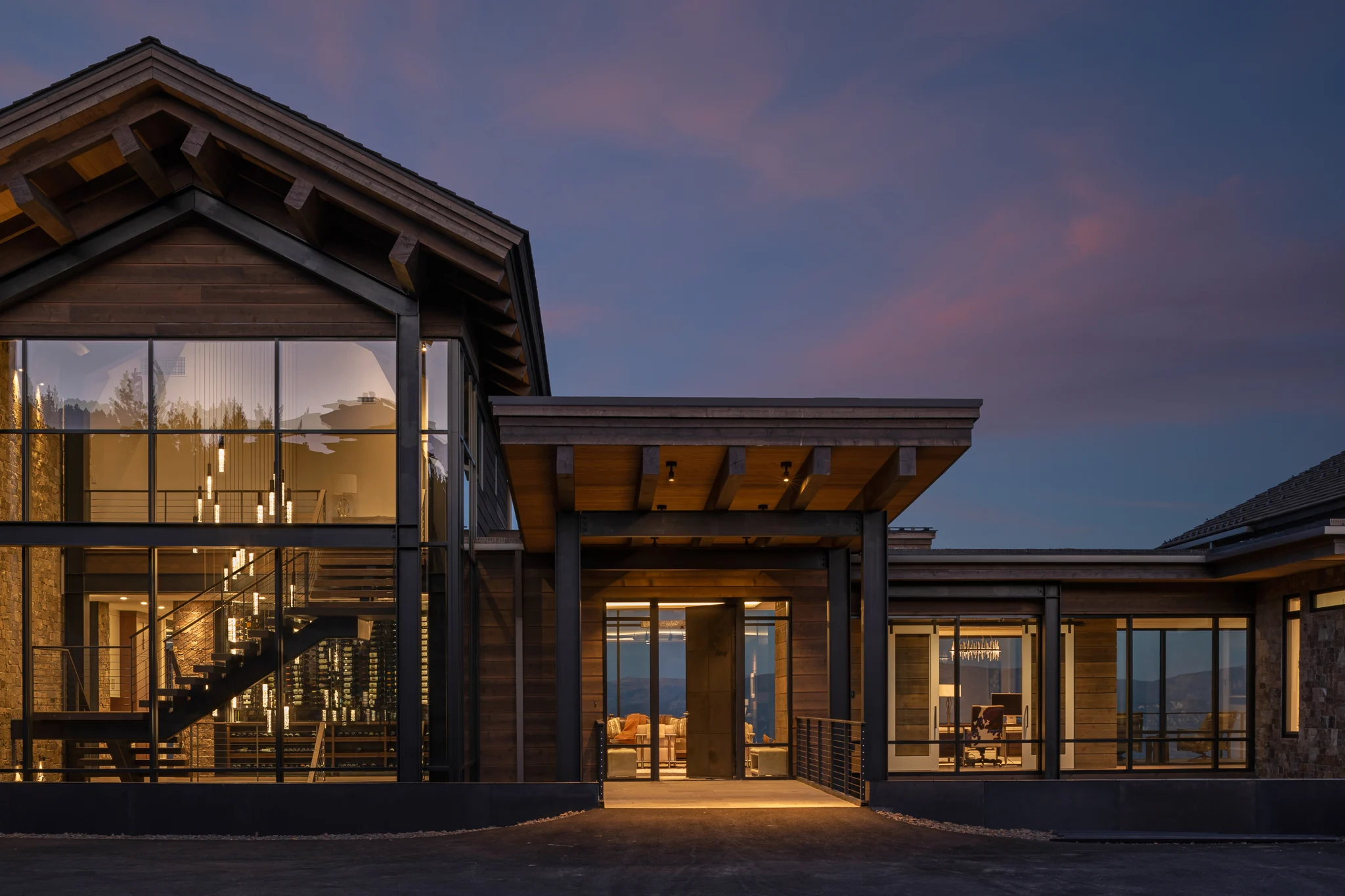
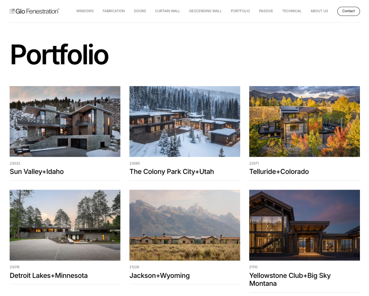
Glo designs and fabricates European window and door systems in the USA for high-end homes across the American West, from Yellowstone Club to Sun Valley and Telluride. Its clients are architects and builders.
The name, Glo Windows & Doors, described a product. The work was closer to a design studio’s, and the identity had to say so.
Role
- Audits, brand alignment and a brand persona, with Expedition Studios.
- A new name: Glo Fenestration.
- Six routes, 118 marks and three rounds of identity, to one final mark.
- A 70-page brand guide: logo, type, colour, tone of voice, iconography and imagery.
- The Webflow website, print and signage.
A name for the whole business
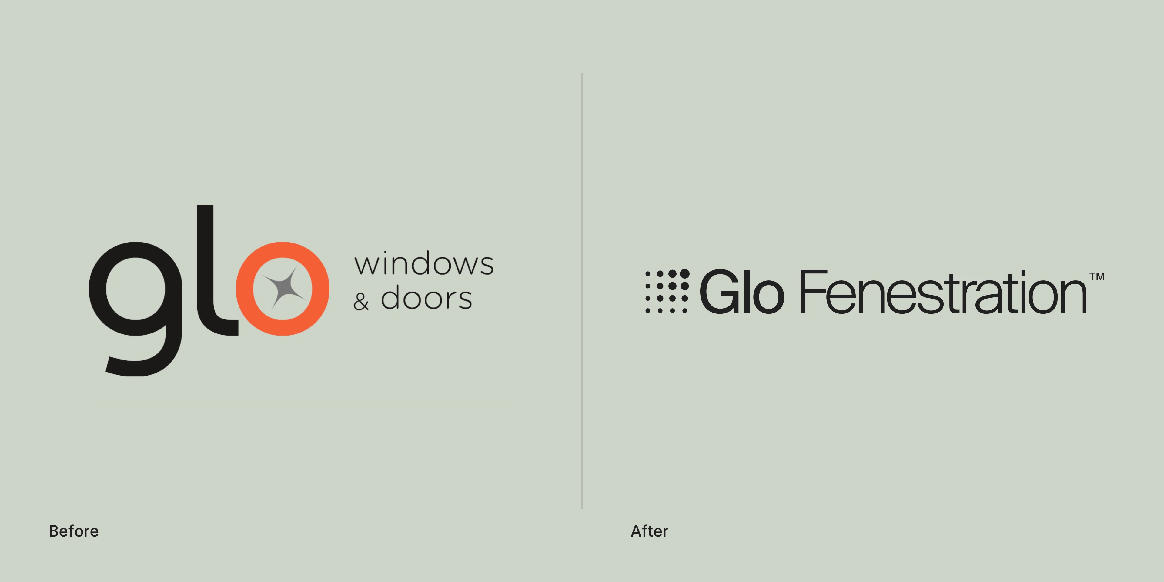
“Windows & Doors” listed products. Fenestration is the architect’s word for the design and placement of every opening in a building, which is the work Glo does. The new name gave the business room to grow into a studio.
Six routes
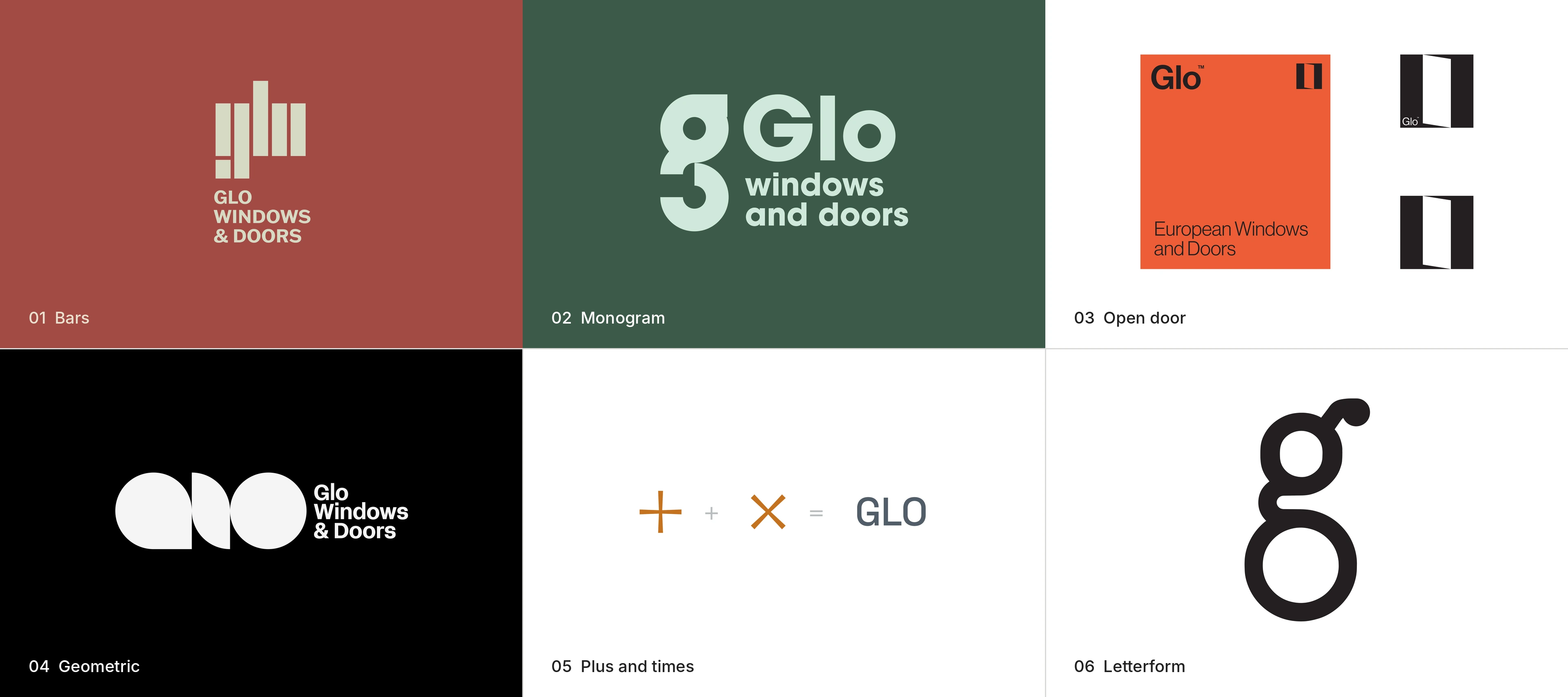
The first viva, in April 2023, put six routes in front of Glo: bars, a monogram, an open door, geometric letterforms, a plus and a times, and a single g. Each tested a different idea of what the business was.
118 marks, three rounds
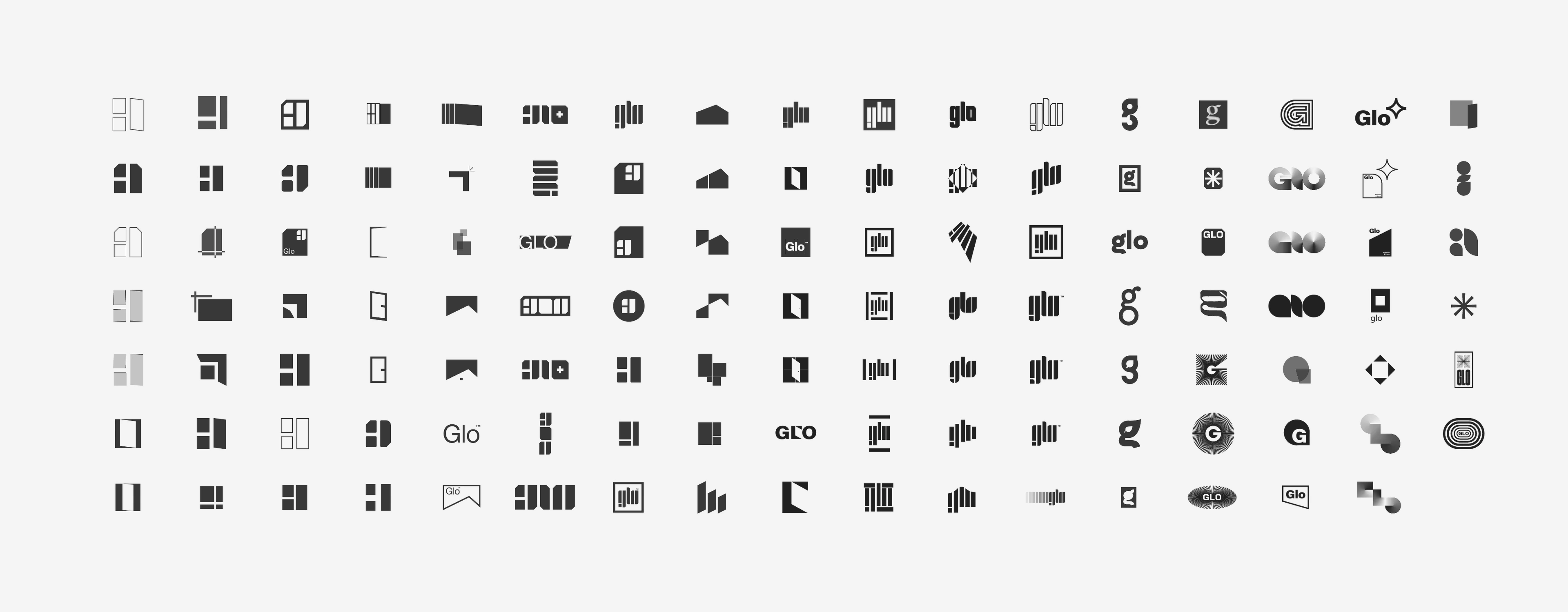
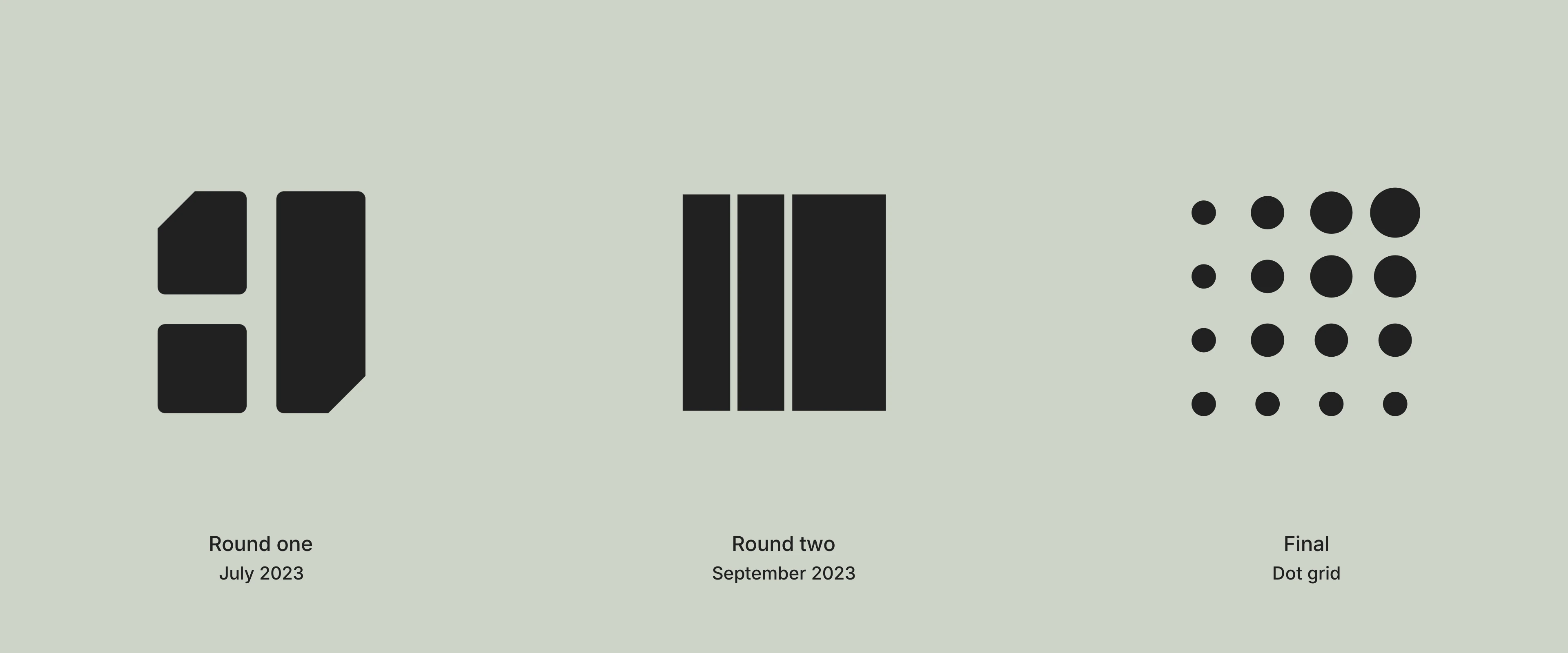
The first round gave Glo a symbol: windows and a door stacked into a G. Logo designer Shane Cody then drew 118 more marks across windows, doors, bars and letterforms. The second round stripped it back to three vertical lines. The final mark is a grid of sixteen dots.
Built on a grid
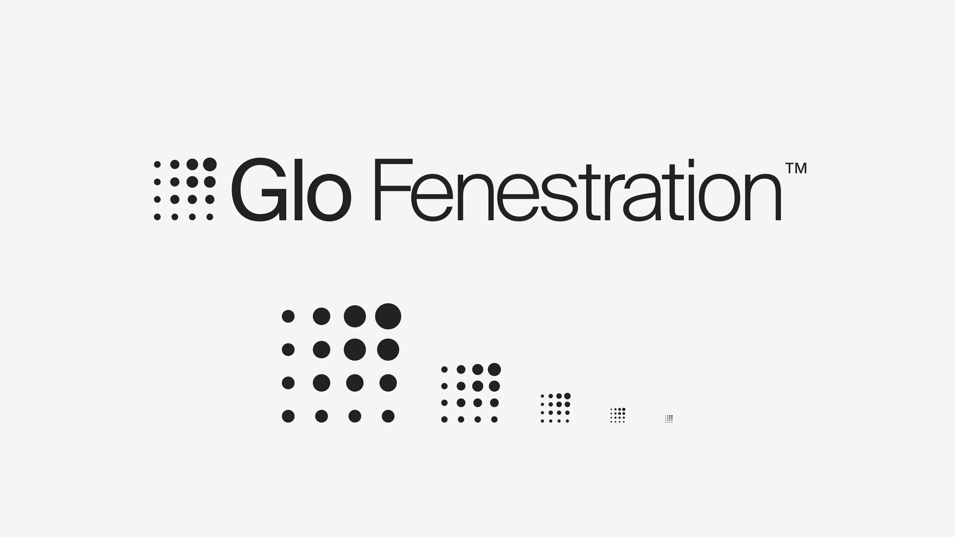
The mark is drawn on the grid that sits under every architectural drawing: four rows, four columns and four dot sizes, growing towards the top right. It holds its shape from a site sign down to a favicon.

Two typefaces
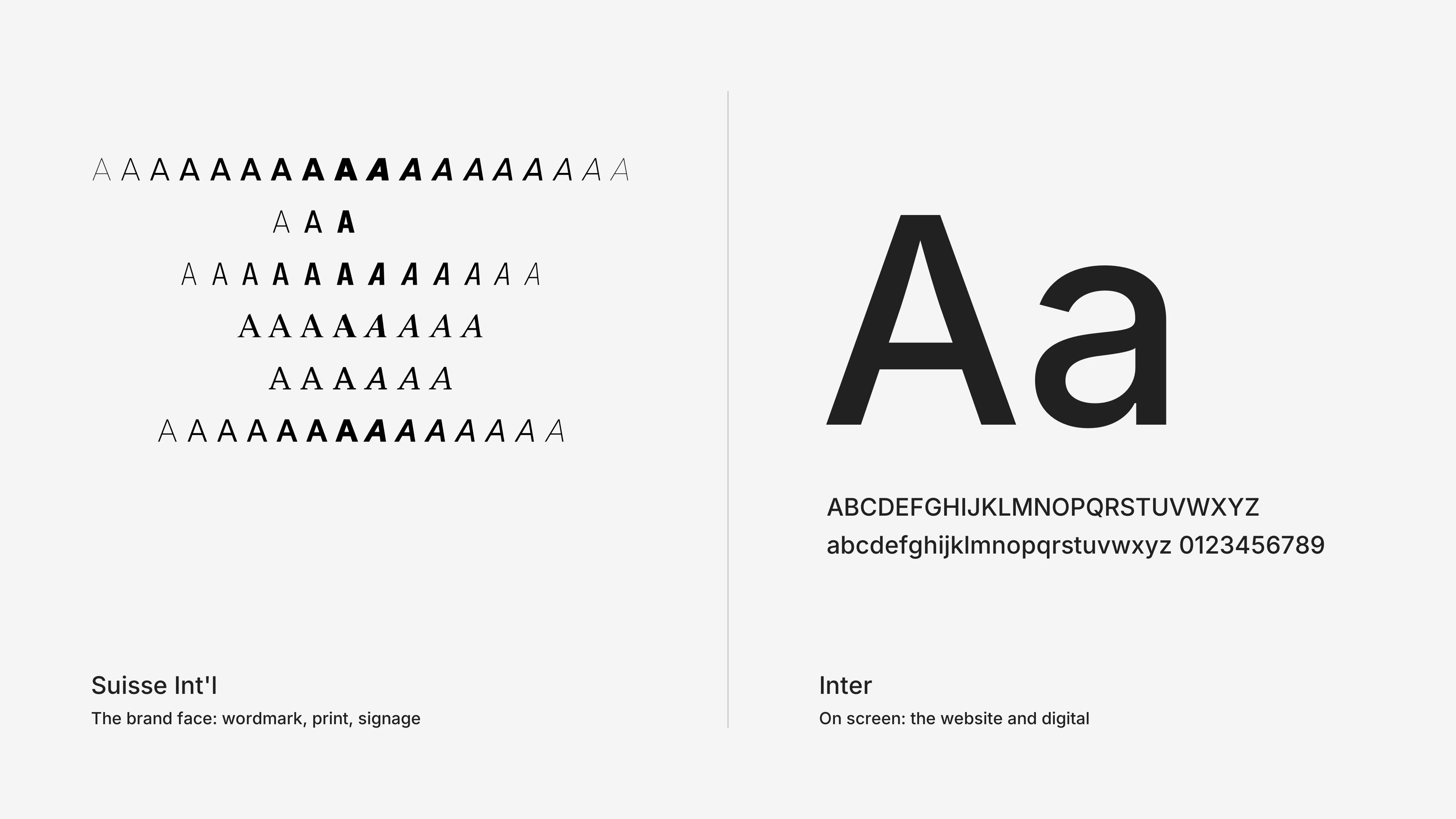
Suisse Int’l sets the wordmark and anything printed. Inter carries the website and everything on screen.
The orange came back
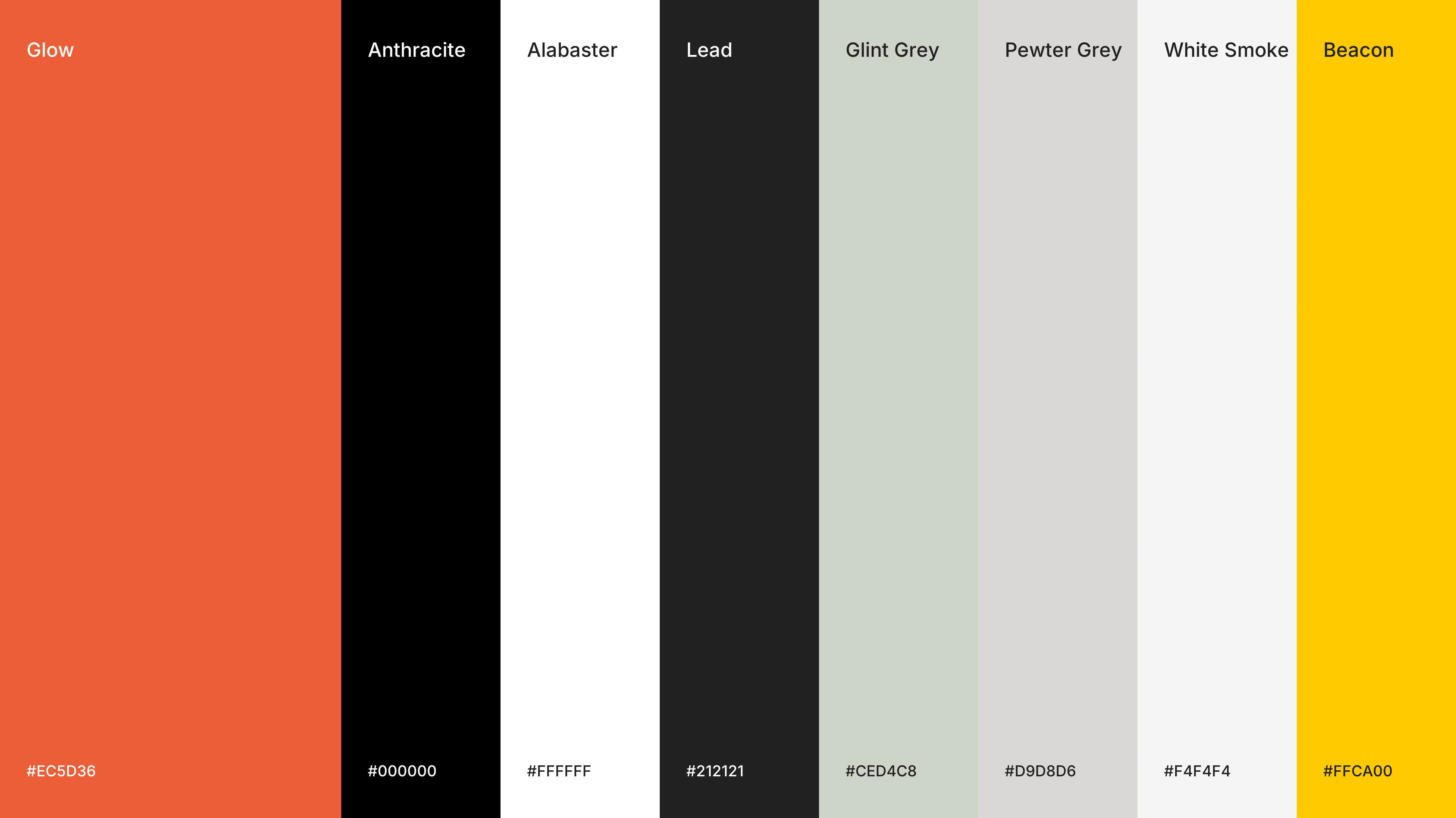
The first round swapped Glo’s orange for a yellow. The final palette brought the orange back as Glow, the one bright colour against Anthracite, Lead and three architectural greys.
How Glo talks
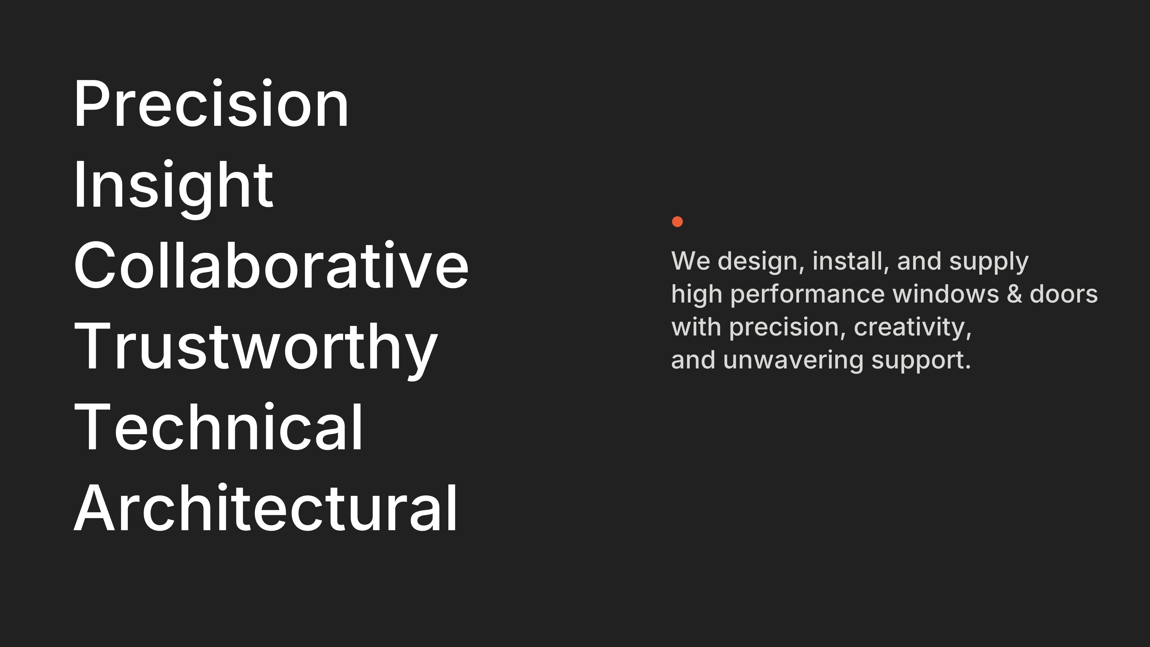
Six words set the tone: precision, insight, collaboration, trust, technical depth and architecture. The guide shows how to write each one, and what to avoid: over-formality, negative language, overpromising and obscurity.
In use
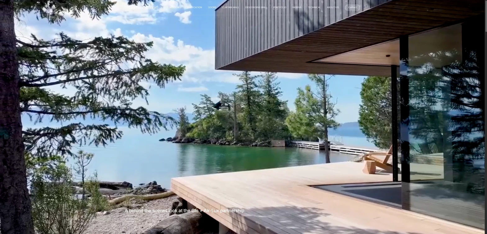
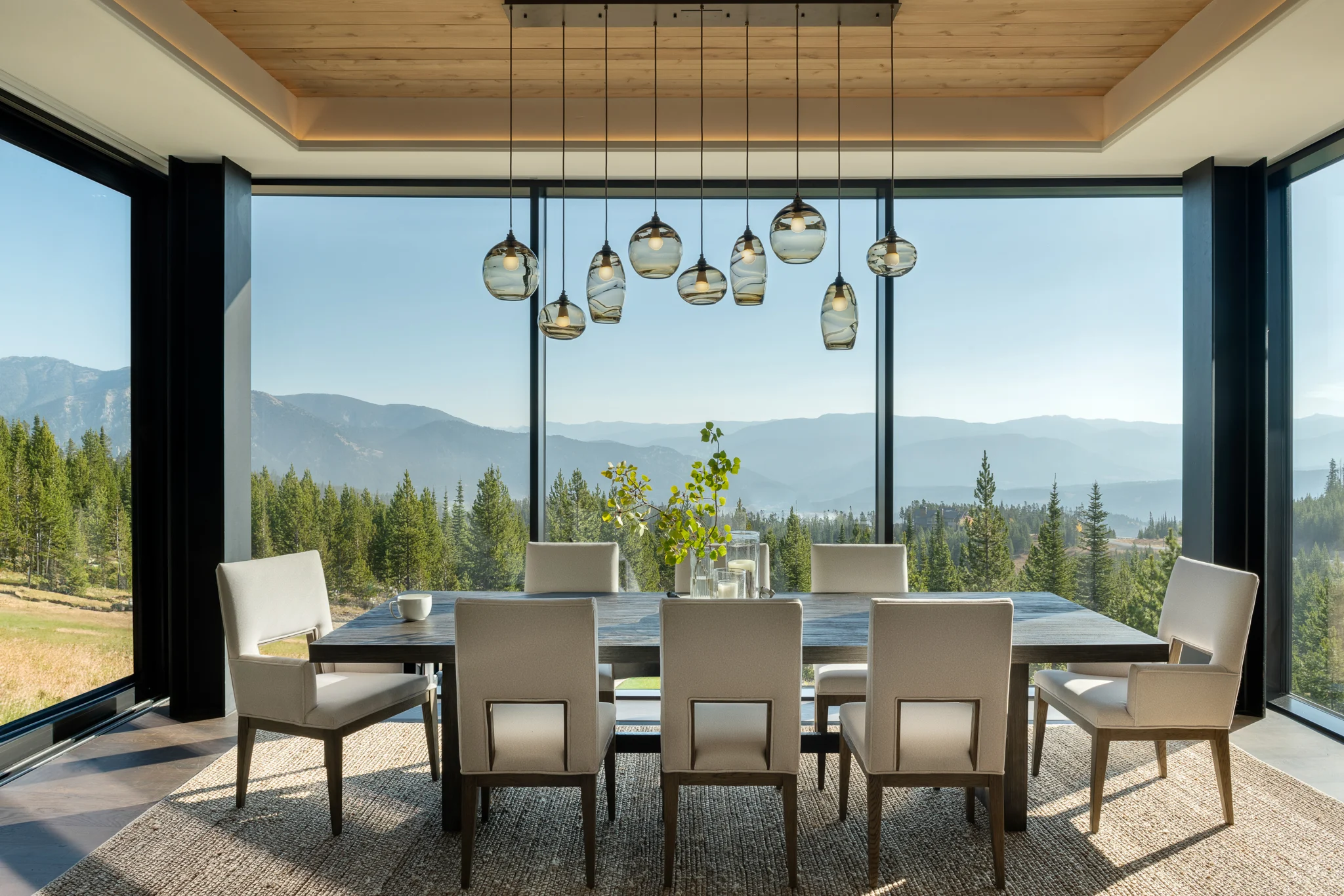
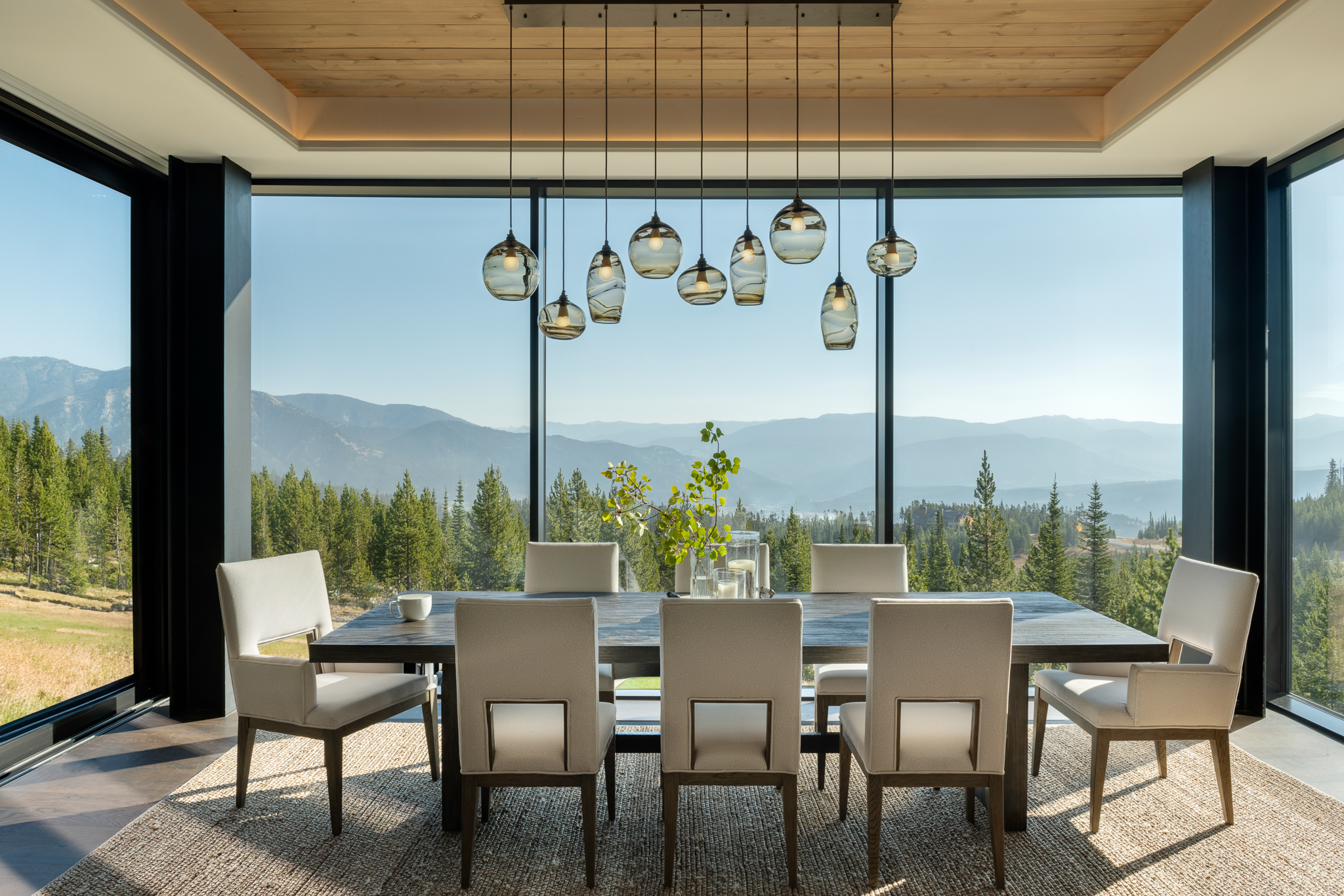
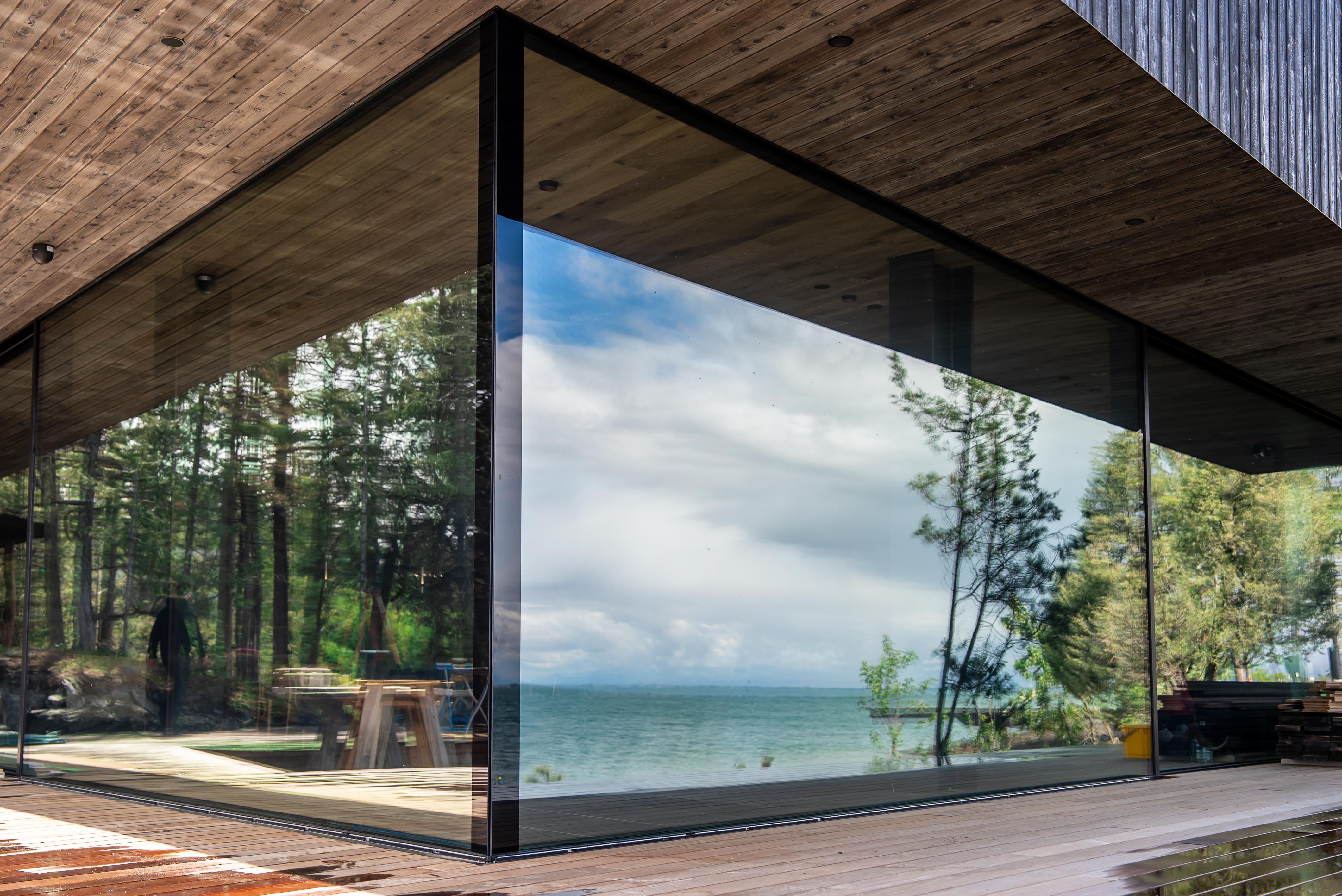
The identity runs through glowindows.com, where Glo’s projects sit beside the products, the technical drawings and the architects it works with.
01 — Challenge
Glo designs and fabricates European window and door systems in the USA for high-end homes across the American West. Its clients are architects and builders.
The name, Glo Windows & Doors, described a product. The work was closer to a design studio’s, and the identity had to say so.
02 — Role
- Audits, brand alignment and a brand persona, with Expedition Studios.
- A new name: Glo Fenestration.
- Six routes, 118 marks and three rounds of identity, to one final mark.
- A 70-page brand guide: logo, type, colour, tone of voice, iconography and imagery.
- The Webflow website, print and signage.
03 — Approach
A dot-grid mark drawn on the architect’s grid, Suisse Int’l with Inter, and a palette of Anthracite, Lead and architectural greys with Glow orange as the one bright colour.
Identity
04 — Outcome
The brand now runs from the website to the etching on the glass. Glo also introduced Polish Interior to Base Camp, which became one of the studio’s defining brand projects.
Credits
Project Description
Glo designs and fabricates European window and door systems in the USA for high-end homes. Working with Expedition Studios, Base Camp took the business from Glo Windows & Doors to Glo Fenestration: a new name, an identity found over three rounds, a 70-page brand guide and the website.
Client
Glo Fenestration — Brand & Website
Date
2022–2025
Services
Brand Strategy / Naming / Guidelines / Website Design / Webflow
Sector
Architectural fenestration
The work. What we did, and what it changed.
Glo designs and fabricates European window and door systems in the USA for high-end homes across the American West. Its clients are architects and builders.
The name, Glo Windows & Doors, described a product. The work was closer to a design studio’s, and the identity had to say so.
- Audits, brand alignment and a brand persona, with Expedition Studios.
- A new name: Glo Fenestration.
- Six routes, 118 marks and three rounds of identity, to one final mark.
- A 70-page brand guide: logo, type, colour, tone of voice, iconography and imagery.
- The Webflow website, print and signage.
A dot-grid mark drawn on the architect’s grid, Suisse Int’l with Inter, and a palette of Anthracite, Lead and architectural greys with Glow orange as the one bright colour.
The brand now runs from the website to the etching on the glass. Glo also introduced Polish Interior to Base Camp, which became one of the studio’s defining brand projects.
A studio, not a supplier.
“The work wasn't just about making it look better — it was about building a clearer relationship between product, story and experience.”
Related Work — More from the studio. Selected projects where brand, design, and performance move as one.


Shackleton × Defender — Rally Partnership
Partnership Strategy / Concept / Production / Creative Direction
Shackleton — Made to Move
Campaign Concept / Production / Talent / Creative Direction

Shackleton — The Exploration System
Brand Strategy / Product Strategy / System Design / Creative Direction