Burnt Orange
A website for a film and photography studio: commercial work with a documentary instinct.
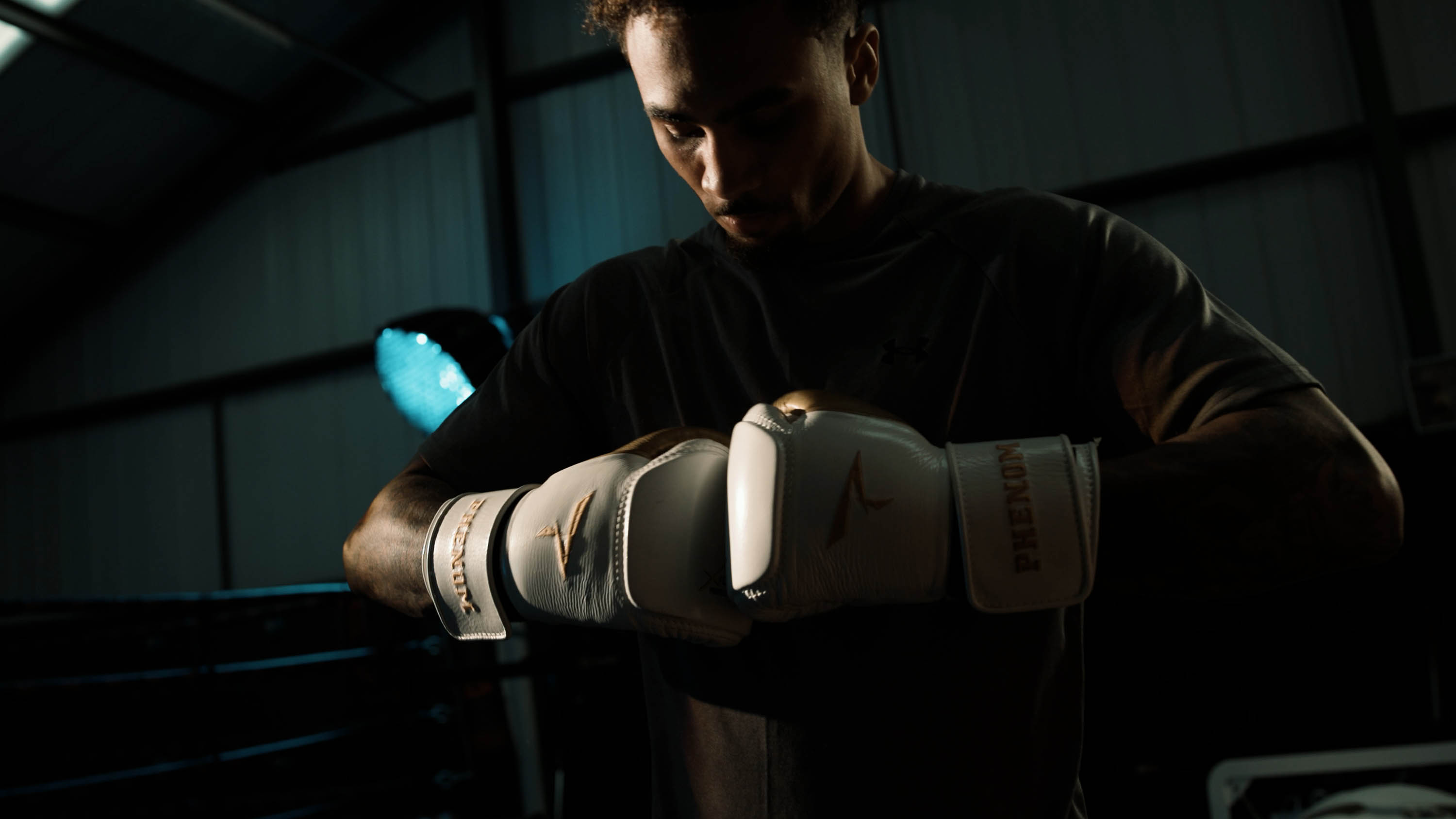
Commercial storytelling with documentary instinct.
Overview
Burnt Orange is the commercial studio of photographer and filmmaker Toby Roney. Base Camp designed and built its site in 2026, separate from Toby’s personal portfolio, on a design system the studio now runs itself.
Outcome
Live on burnt-orange.com since October 2026. Toby adds projects himself and has already published his tenth.
Challenge
Toby needed a studio site that sat apart from his personal portfolio and spoke to commissioning clients. He wanted it lean, led by a short, sharp reel.
Base Camp argued for one addition: a page for each kind of work, so the studio could be found in search as well as seen once someone had the link.
Role
- Website strategy and structure.
- A token-based design system in Webflow.
- CMS collections for projects, categories and disciplines.
- A homepage reel, selected work, client logos and an enquiry form with a budget field.
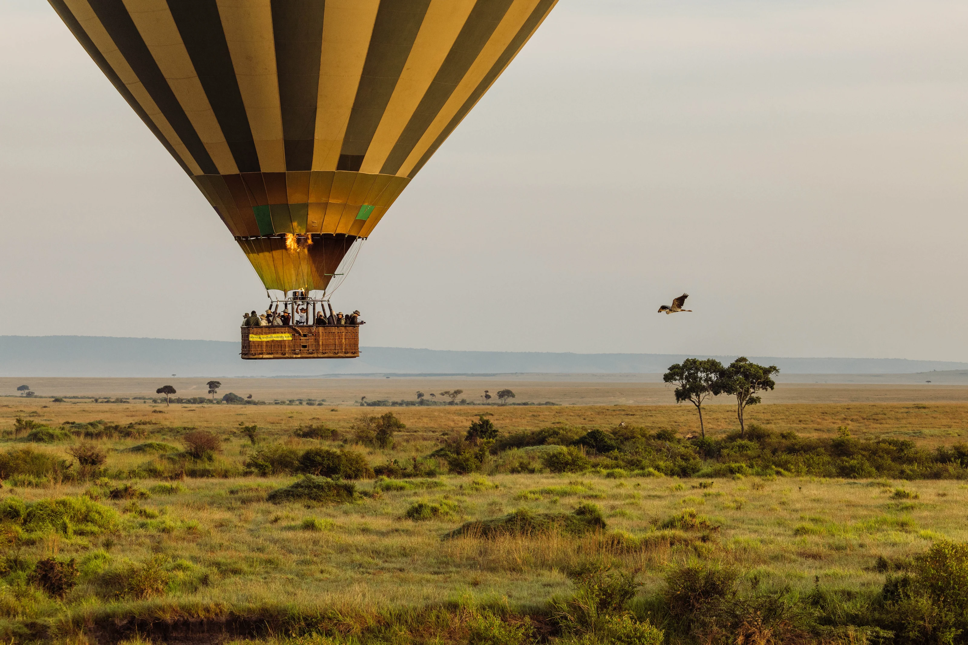
- Landing pages for outdoor and adventure, hotels and hospitality, and schools and performing arts.
- Stories for Good and How We Use AI pages.
- Copy edits across every project, and a CMS guide for Toby.
Approach
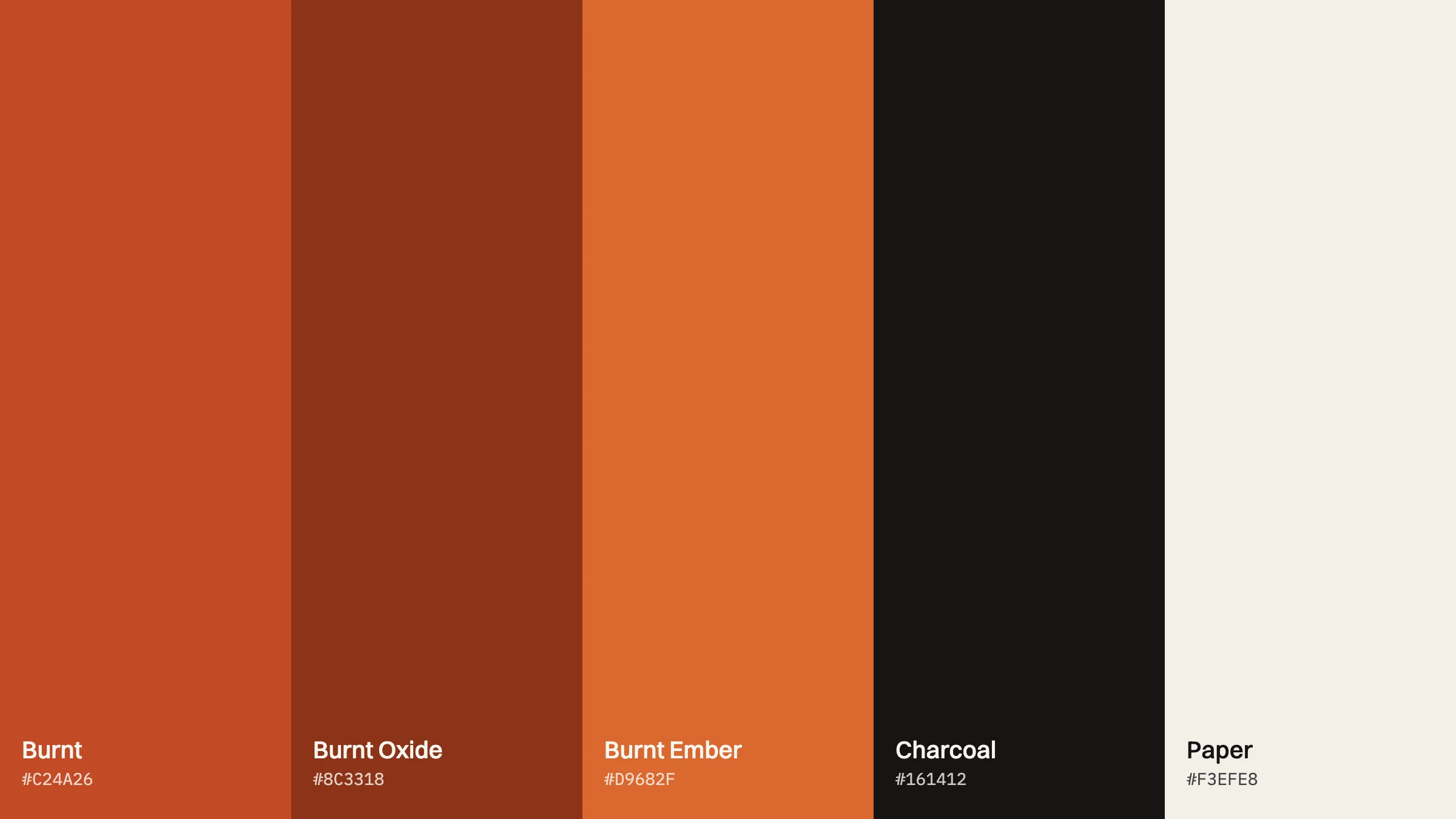
The site takes its colour from the name: Burnt, Oxide and Ember against charcoal and paper. Switzer carries the type, with Geist Mono for labels.
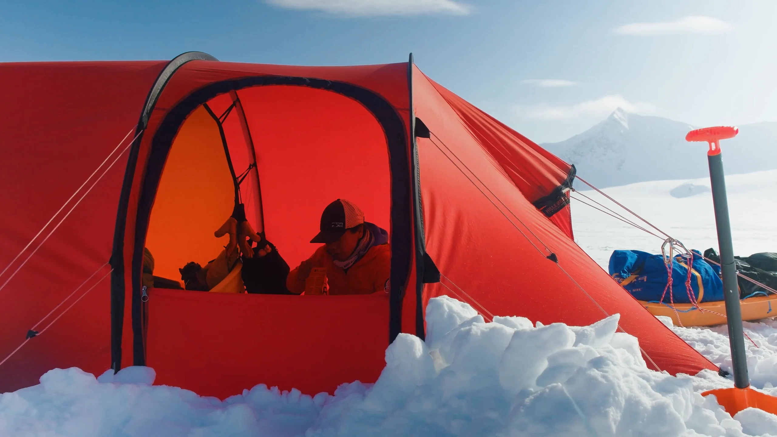
The homepage opens on “Commercial film and photography.” and works through four disciplines: film, stills, production and campaign assets. Clients include YETI, Rab, Ellis Brigham, Flash Pack and Shackleton. A Stories for Good page sets out the studio’s pledge: 1% of profits funds free filming days for charities and community projects.
Identity
The palette in full.
01 — Challenge
Toby needed a studio site that sat apart from his personal portfolio and spoke to commissioning clients. He wanted it lean, led by a short, sharp reel.
Base Camp argued for one addition: a page for each kind of work, so the studio could be found in search as well as seen once someone had the link.
02 — Role
- Website strategy and structure.
- A token-based design system in Webflow.
- CMS collections for projects, categories and disciplines.
- A homepage reel, selected work, client logos and an enquiry form with a budget field.
- Landing pages for outdoor and adventure, hotels and hospitality, and schools and performing arts.
- Stories for Good and How We Use AI pages.
- Copy edits across every project, and a CMS guide for Toby.
03 — Approach
The site takes its colour from the name: Burnt, Oxide and Ember against charcoal and paper. Switzer carries the type, with Geist Mono for labels.
The homepage opens on “Commercial film and photography.” and works through four disciplines: film, stills, production and campaign assets. Clients include YETI, Rab, Ellis Brigham, Flash Pack and Shackleton. A Stories for Good page sets out the studio’s pledge: 1% of profits funds free filming days for charities and community projects.
Identity
04 — Outcome
The site went live on burnt-orange.com in October 2026. Toby now adds projects himself and has already put up his tenth.
Credits
Project Description
Burnt Orange is the commercial studio of photographer and filmmaker Toby Roney. Base Camp designed and built its site in 2026, separate from Toby’s personal portfolio, on a design system the studio now runs itself.
Client
Burnt Orange — Website
Date
2026
Services
Website Strategy / Design System / Webflow / CMS / SEO
Sector
Film & photography studio
The work. What we did, and what it changed.
Toby needed a studio site that sat apart from his personal portfolio and spoke to commissioning clients. He wanted it lean, led by a short, sharp reel.
Base Camp argued for one addition: a page for each kind of work, so the studio could be found in search as well as seen once someone had the link.
- Website strategy and structure.
- A token-based design system in Webflow.
- CMS collections for projects, categories and disciplines.
- A homepage reel, selected work, client logos and an enquiry form with a budget field.
- Landing pages for outdoor and adventure, hotels and hospitality, and schools and performing arts.
- Stories for Good and How We Use AI pages.
- Copy edits across every project, and a CMS guide for Toby.
The site takes its colour from the name: Burnt, Oxide and Ember against charcoal and paper. Switzer carries the type, with Geist Mono for labels.
The homepage opens on “Commercial film and photography.” and works through four disciplines: film, stills, production and campaign assets. Clients include YETI, Rab, Ellis Brigham, Flash Pack and Shackleton. A Stories for Good page sets out the studio’s pledge: 1% of profits funds free filming days for charities and community projects.
The site went live on burnt-orange.com in October 2026. Toby now adds projects himself and has already put up his tenth.
Commercial storytelling with documentary instinct.
“The work wasn't just about making it look better — it was about building a clearer relationship between product, story and experience.”
Related Work — More from the studio. Selected projects where brand, design, and performance move as one.


Shackleton × Defender — Rally Partnership
Partnership Strategy / Concept / Production / Creative Direction
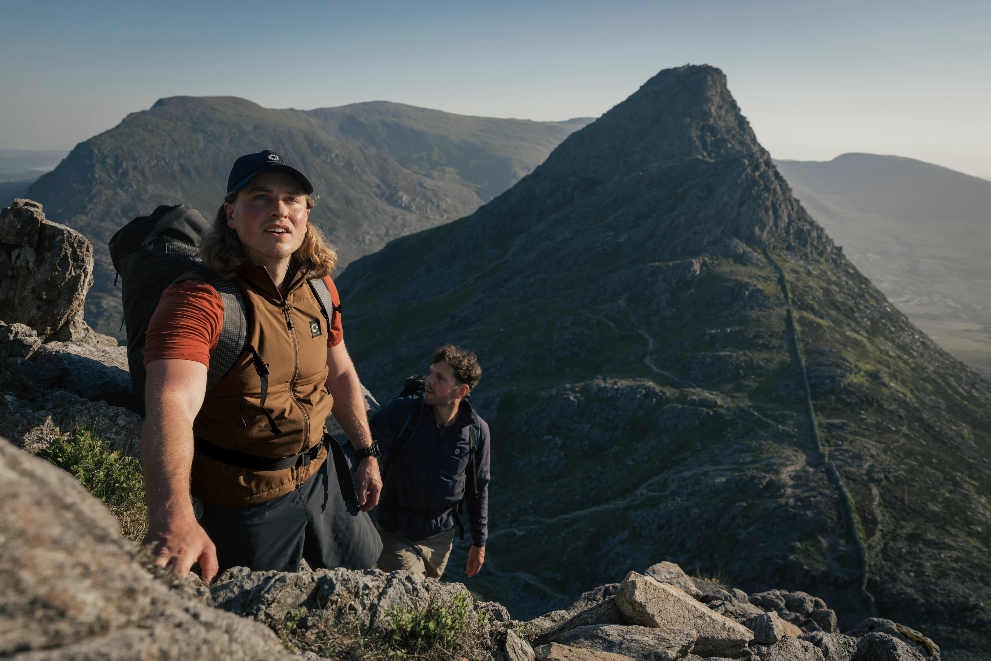
Shackleton — Made to Move
Campaign Concept / Production / Talent / Creative Direction
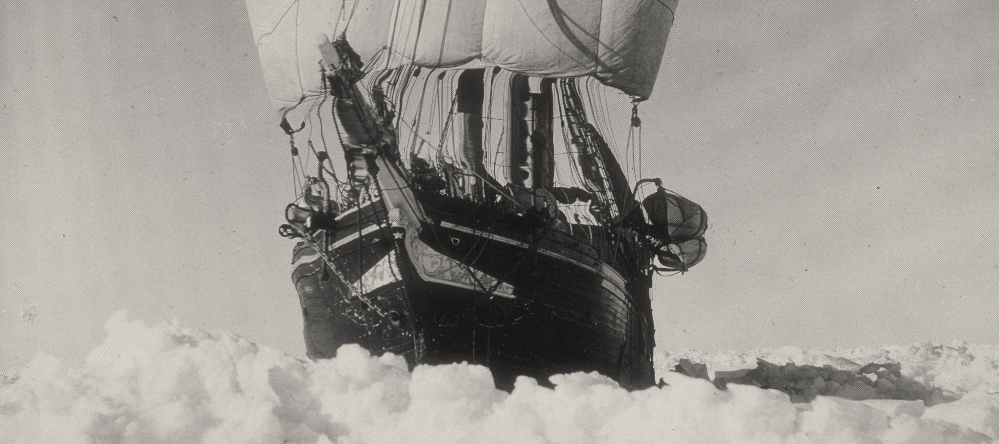
Shackleton — The Exploration System
Brand Strategy / Product Strategy / System Design / Creative Direction