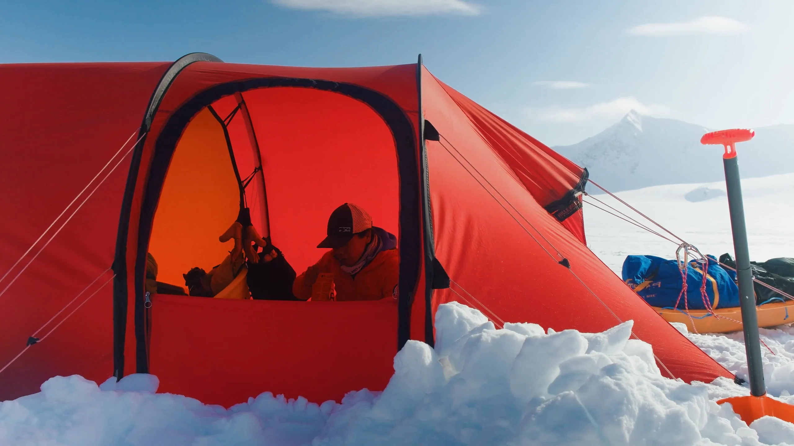
APPG for the Polar Regions
An identity drawn from historic polar maps, and a digital home for Parliament's cross-party polar group, from 2022 through its relaunch in 2026.
A parliamentary group's officers change with every election. The site was built so that keeping it accurate is a small job, not a project.
Overview
The All-Party Parliamentary Group for the Polar Regions connects MPs and Peers with the science, geopolitics and technology of the Arctic and Antarctic. Base Camp redrew its mark, built polarregions.co.uk in Webflow, and updated it when the group was re-established under George Freeman MP in 2026.
Outcome
The mark and the site have been the group’s public face since January 2023.
Challenge
The All-Party Parliamentary Group for the Polar Regions informs and educates MPs and Peers on polar issues, and hosts regular meetings in Parliament that are open to non-Parliamentarians. When Base Camp started work in late 2022, the group was chaired by James Gray MP.
The group's logos had been used inconsistently, and it had no single place to publish its briefings, events and news. An APPG's membership and officers change with each Parliament, so the identity had to hold steady while the people didn't, and the site had to be easy to keep accurate and credible to scientists, diplomats and parliamentarians alike.
Role
- A review of the existing brand assets.
- Research into historic polar maps.
- Redesign of the APPG mark, with mono, colour, Portcullis, wide and stacked versions (December 2022).
- Colour palette, typeface and stationery.
- Webflow design and build. The site went live in January 2023.
- Editorial structure for briefings, papers and news.
- Hosting, domain and ongoing support.
- The 2026 update for the re-established group: new officers, and the relaunch announcement.
Back to the old maps
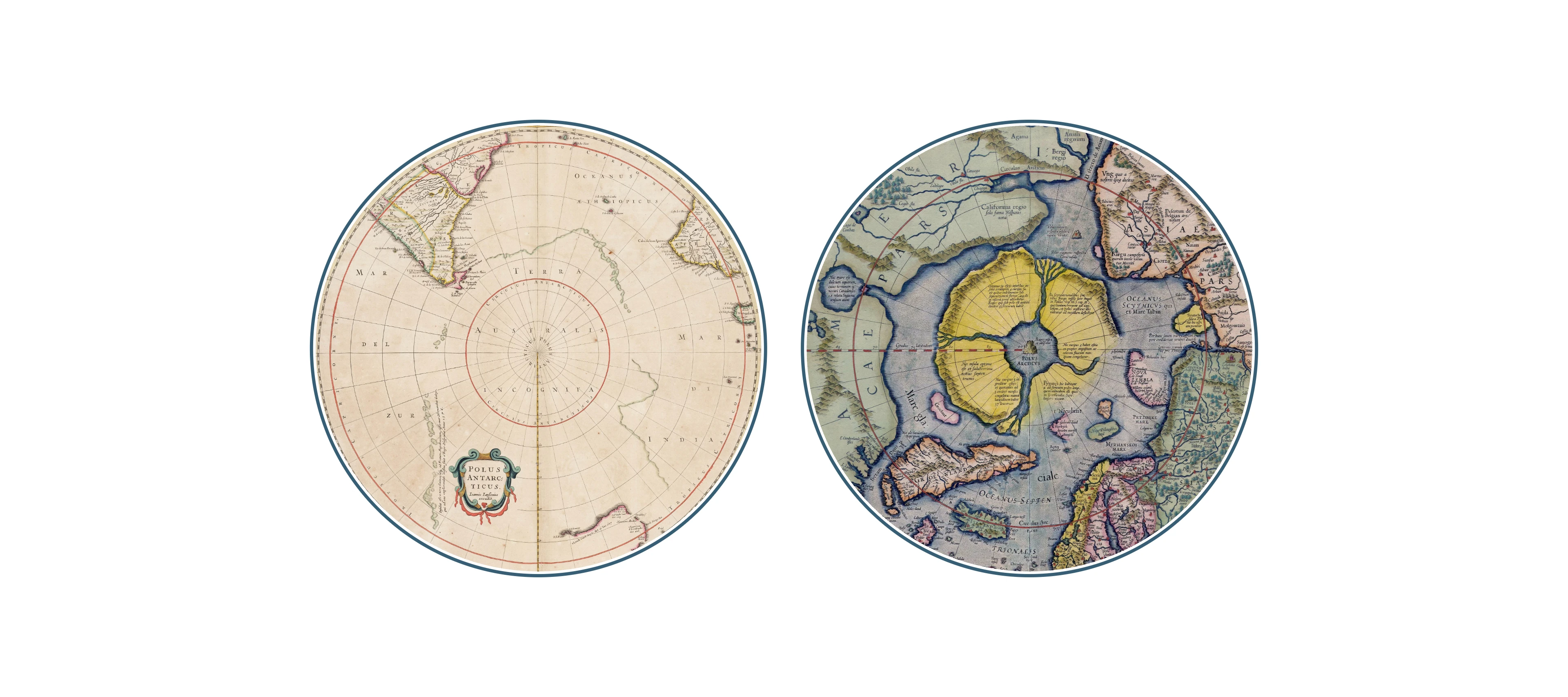
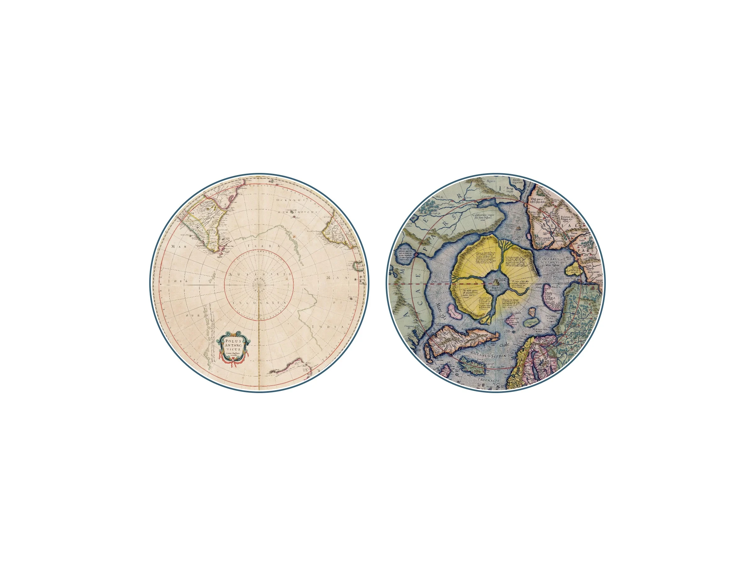
The work began by gathering the group's existing logos and assessing what each did well and badly. Then Base Camp looked further back, into how the poles had been drawn for centuries, to find maps that could be brought back as brand assets.
The circular polar projection is the thread. For centuries, cartographers showed each pole as a disc, its coastline filled in as expeditions returned. The chosen concept took that form and redrew it for the present day. The film at the top of this page follows the same route, from the early maps to the finished mark and the website.
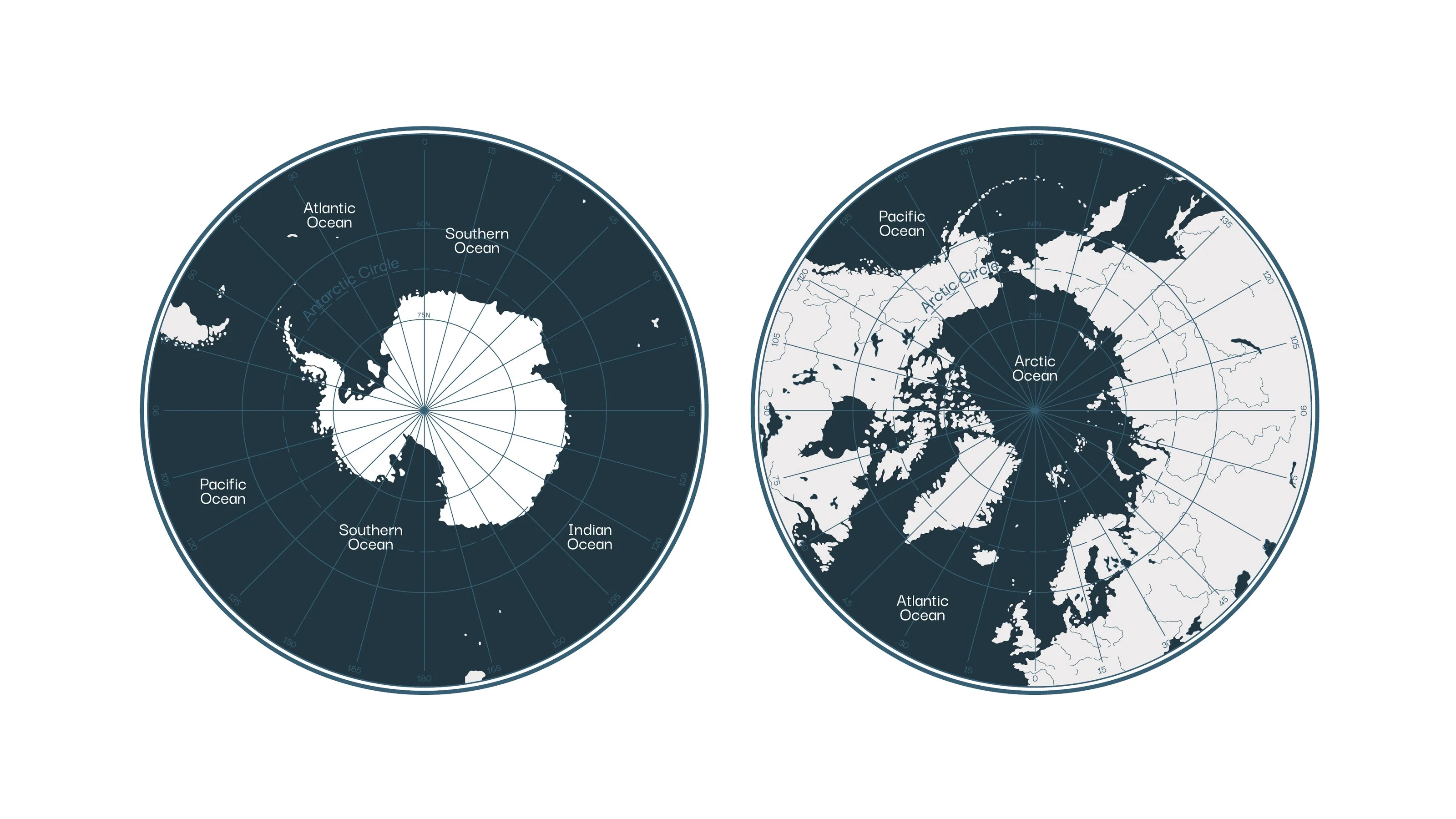
Two hemispheres
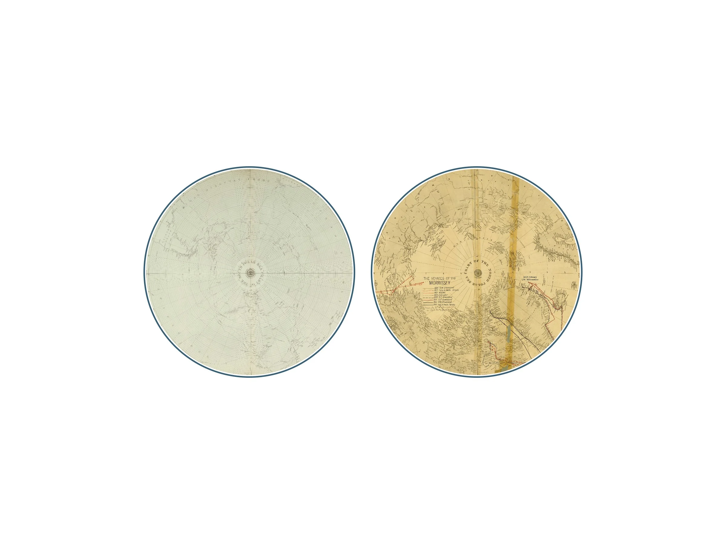
Two modern maps start the design: the Antarctic and the Arctic, showing the countries involved and the ice and glaciers as they stood in 2022.
One silhouette
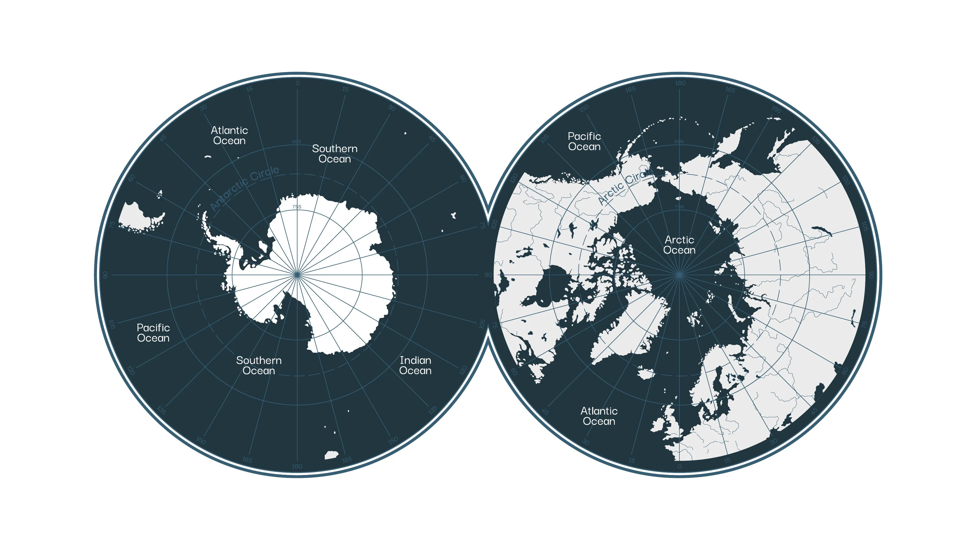
Joined, the two discs make an infinity-shaped outline that still points back to the historic maps. Seen beside the Portcullis and the word mark, it reads at once as the polar regions.
Mono and colour
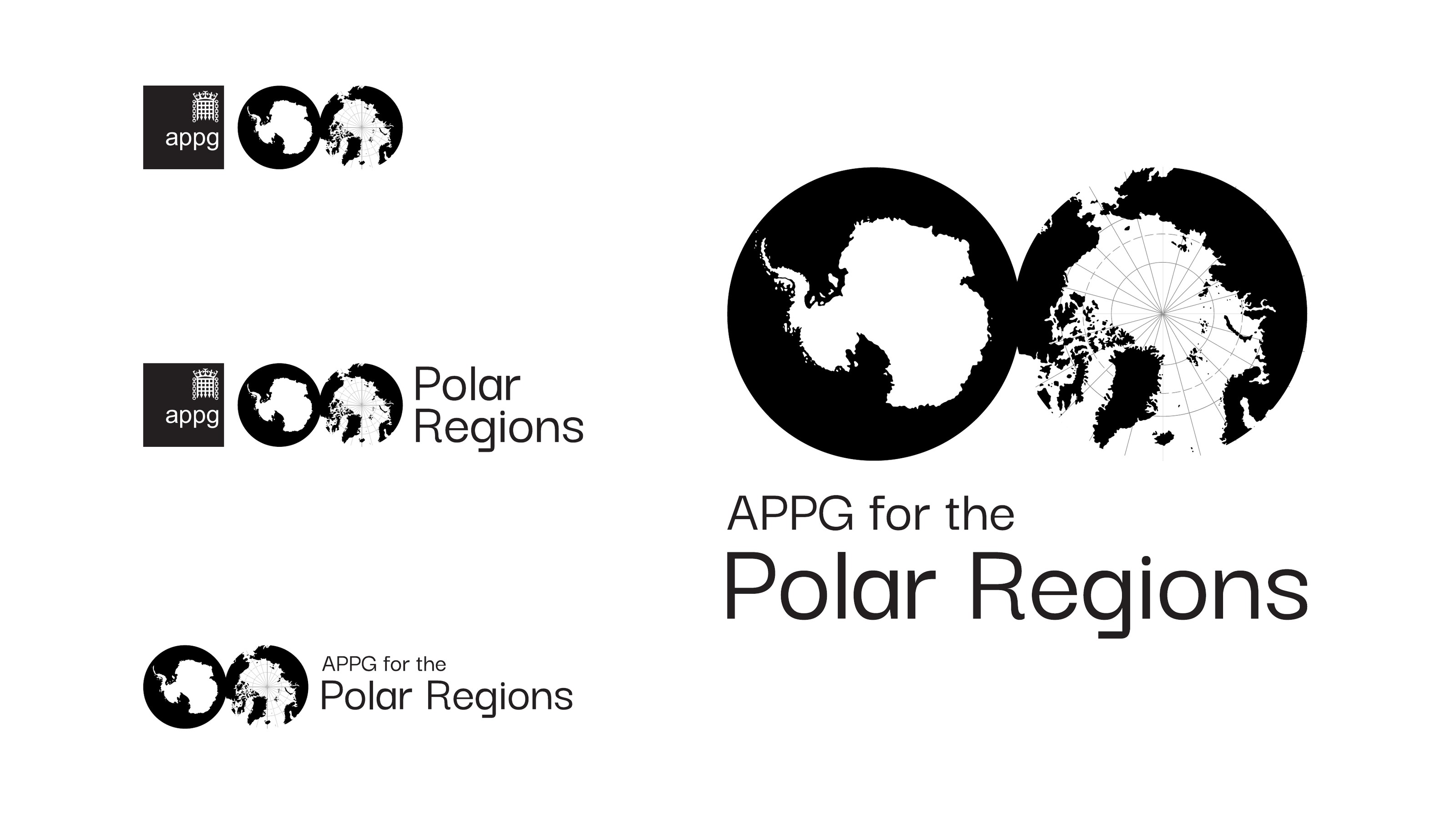
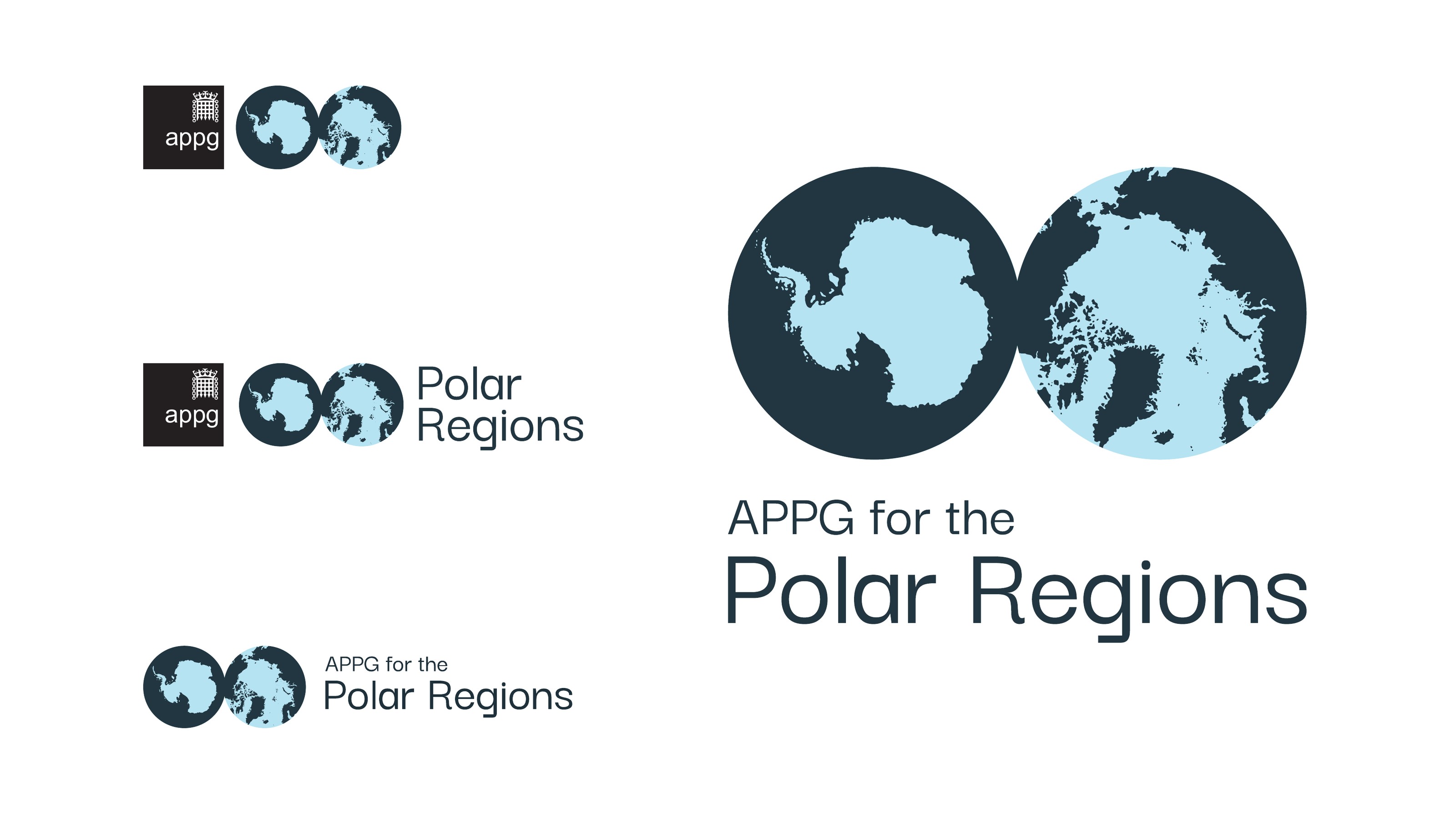
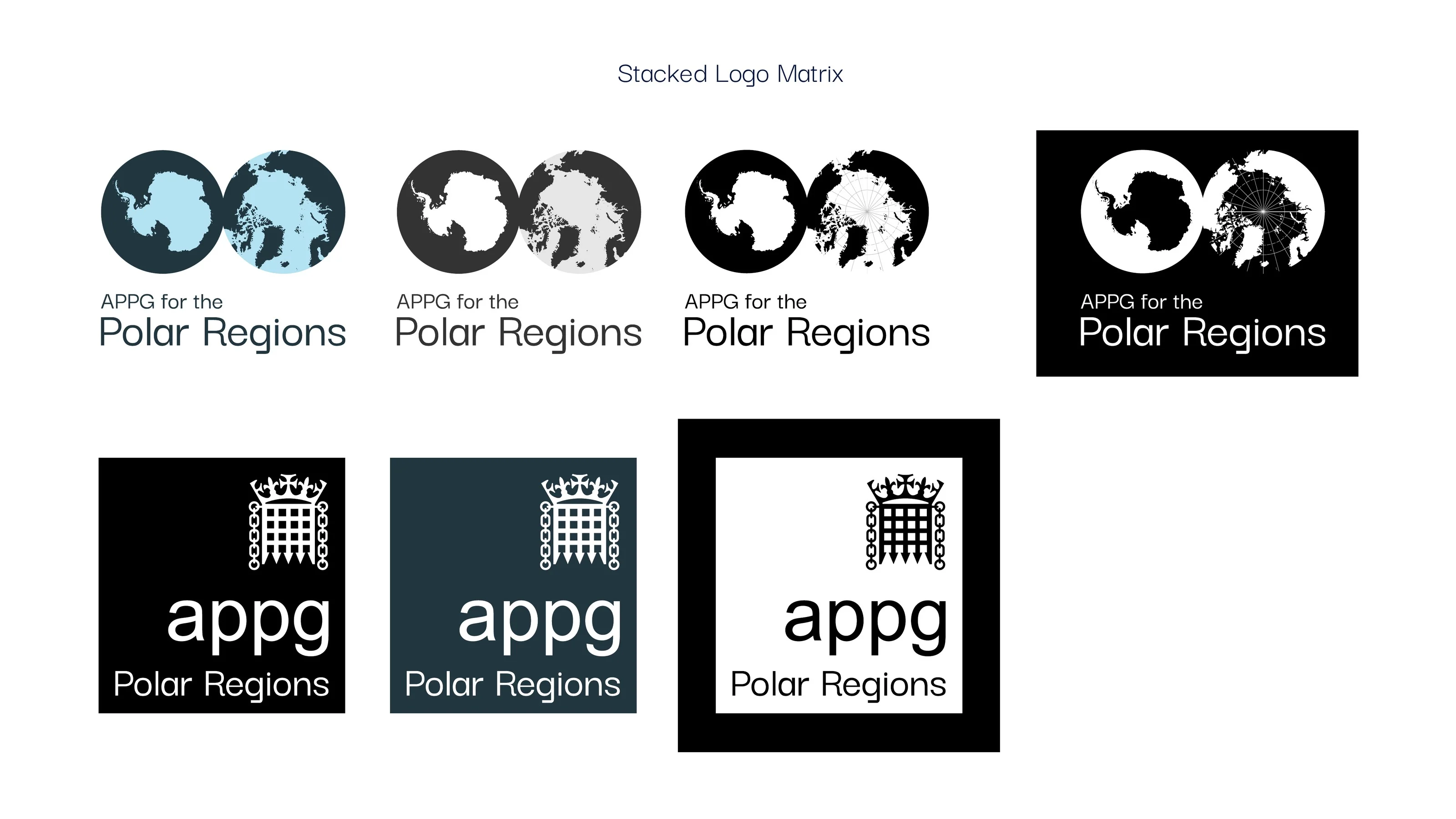
The mono mark is simplified for small sizes and works in black or white across backgrounds, colours and textures. The colour mark brings in two of the brand colours so the outline of the sea shows more clearly, and is used on white only.
The Portcullis lockup
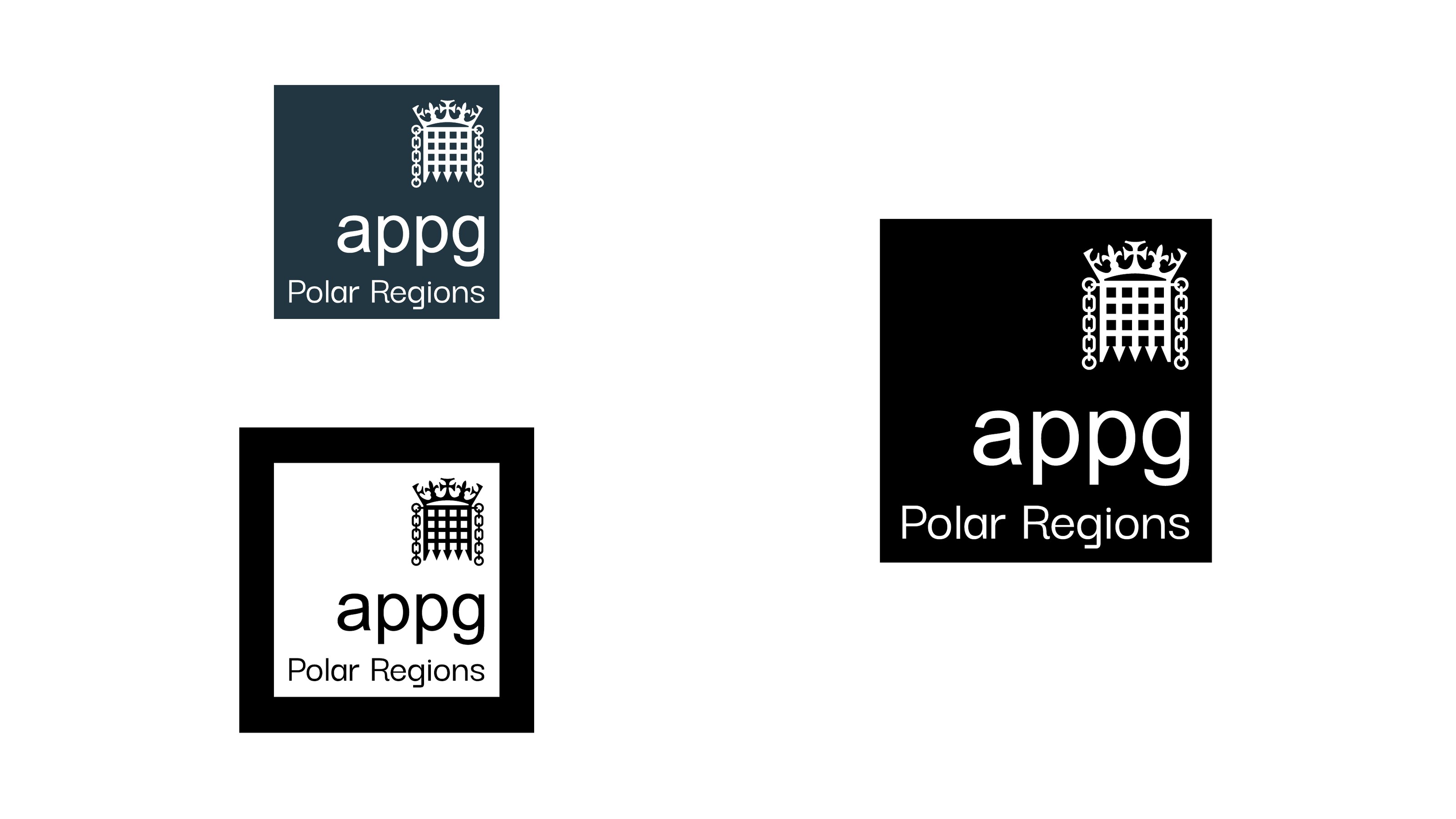
A parliamentary group carries the Portcullis. The lockup sets it in the brand typeface, with the APPG name and supporting text spaced to it, in black, white or APPG Polar Blue.
Colour
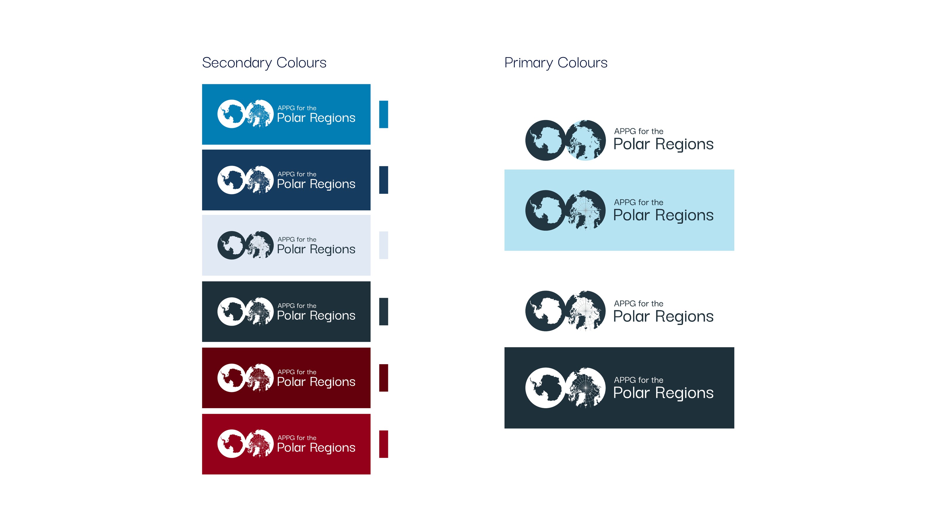
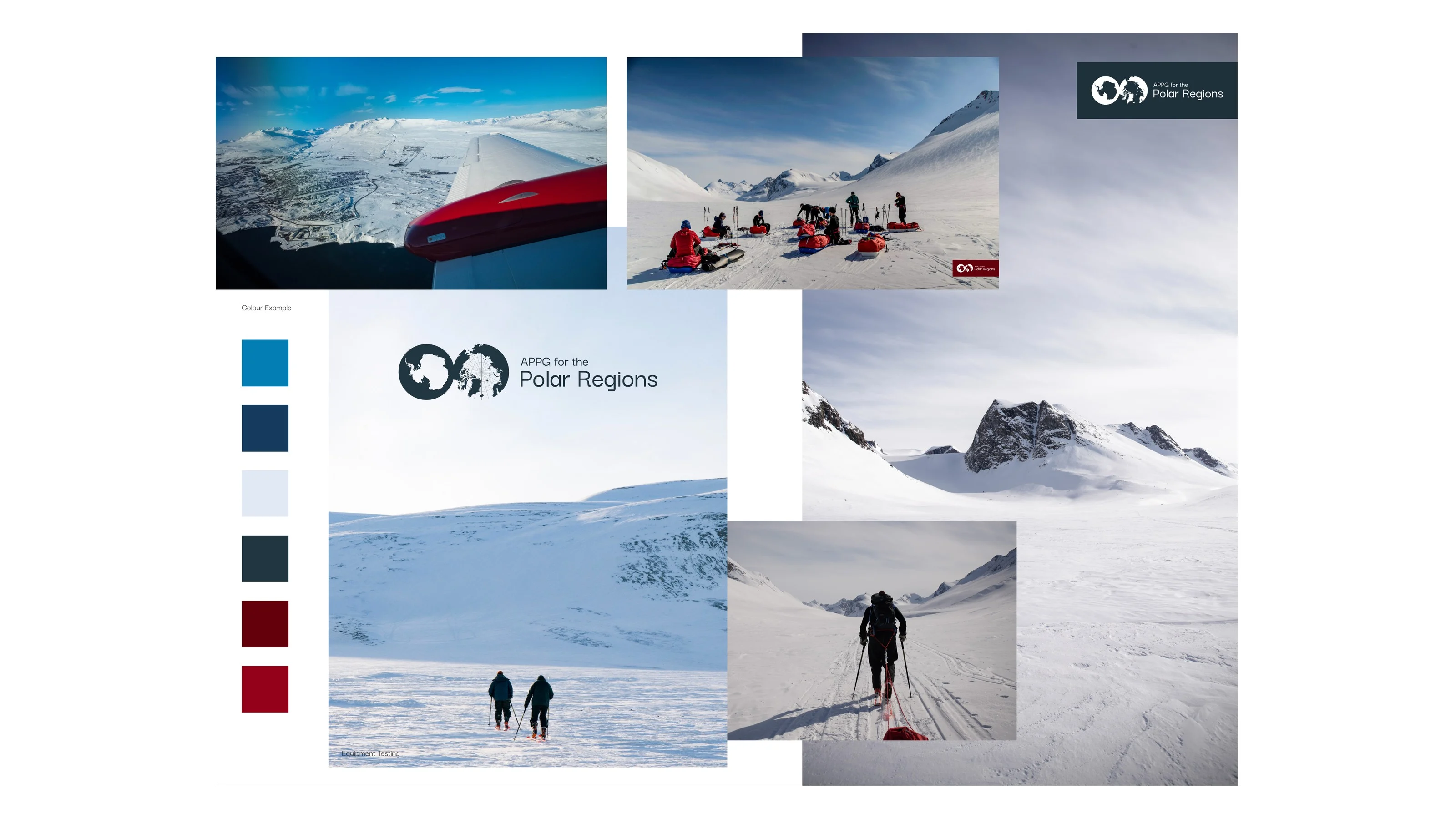
Primary and secondary colours drawn from the polar regions themselves: deep water, sea and ice, with a red accent. They work in print and on screen without Pantone references. The inspiration board shows where they came from, and how the mono mark sits over a textured background.
A logo system
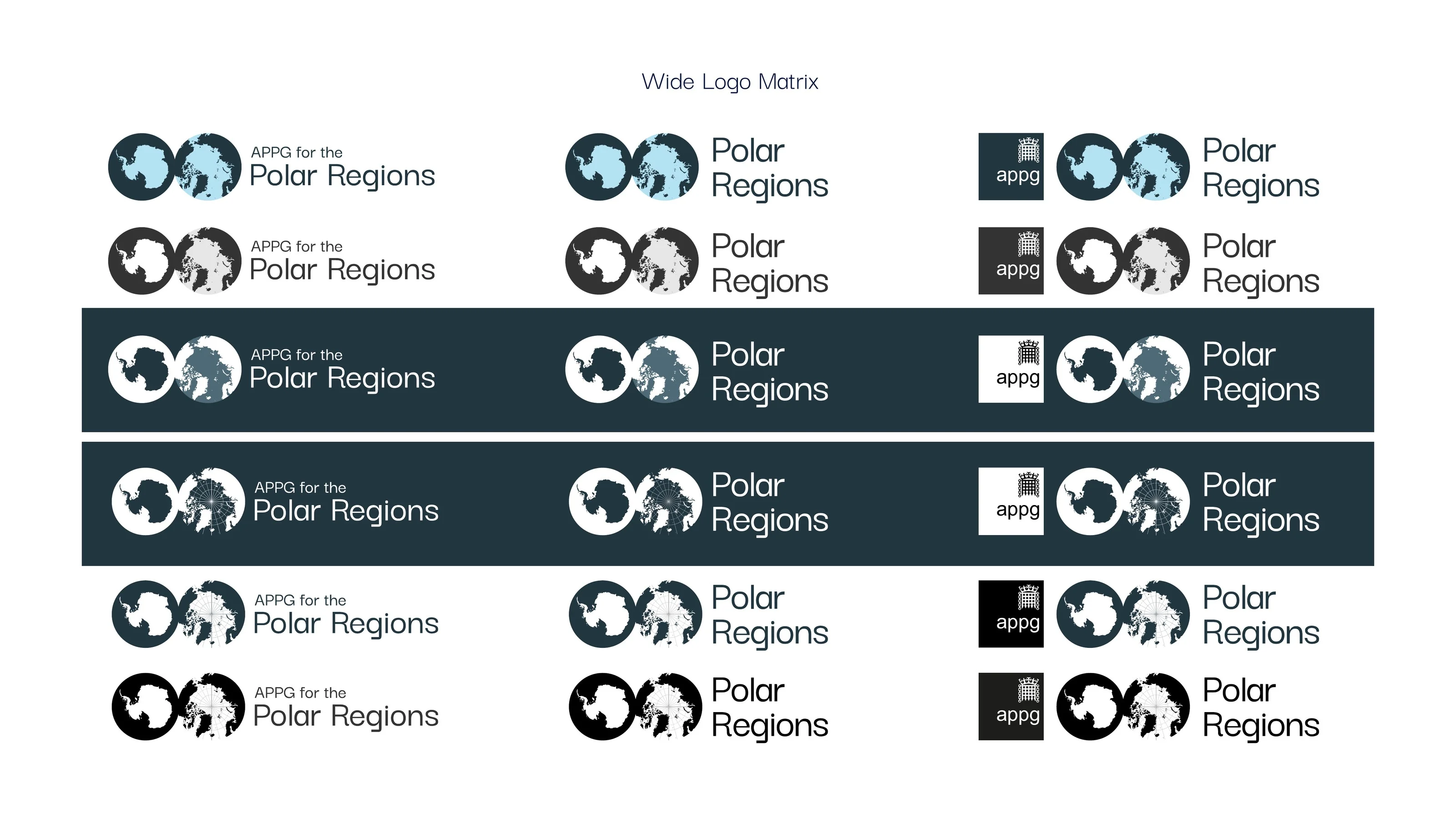
Wide and stacked versions of the logo, each in a full set of colour and background combinations, so the group always has the right one to hand.
Type and stationery
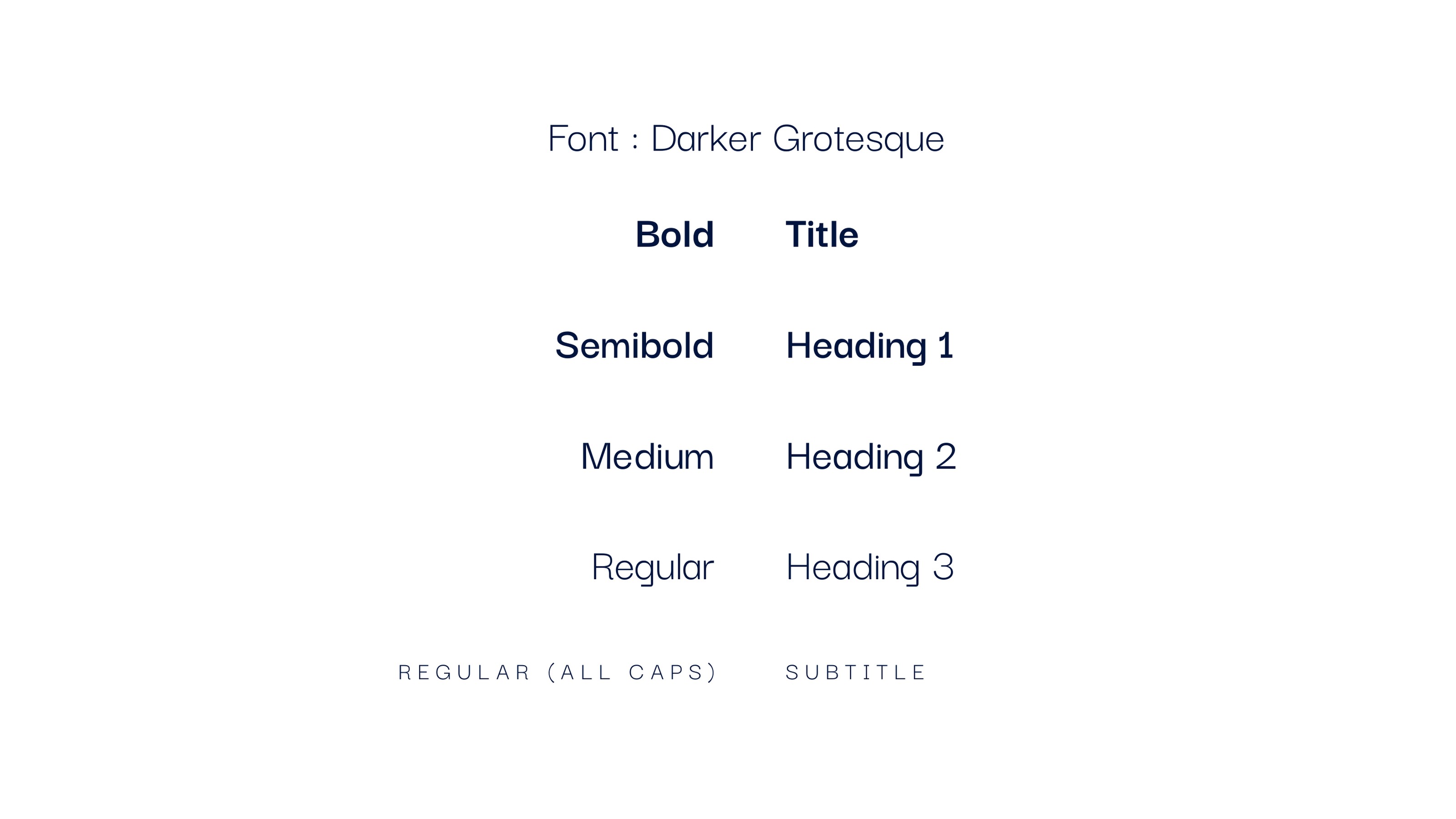
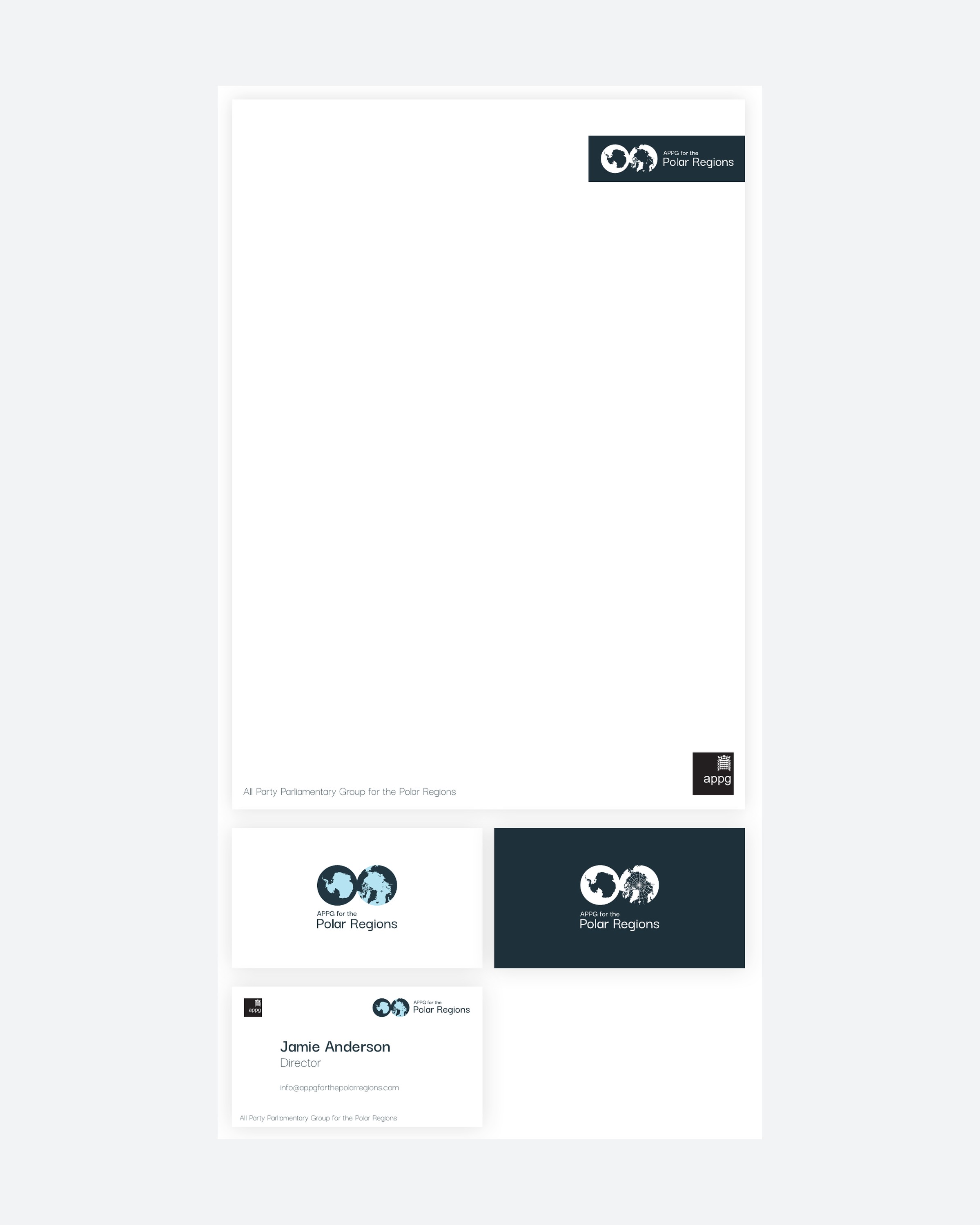
Darker Grotesque was chosen for accessibility: it reads well for a wide range of readers, on screen and in print. It is free for print and web, so the group can use it anywhere without licensing.
The website
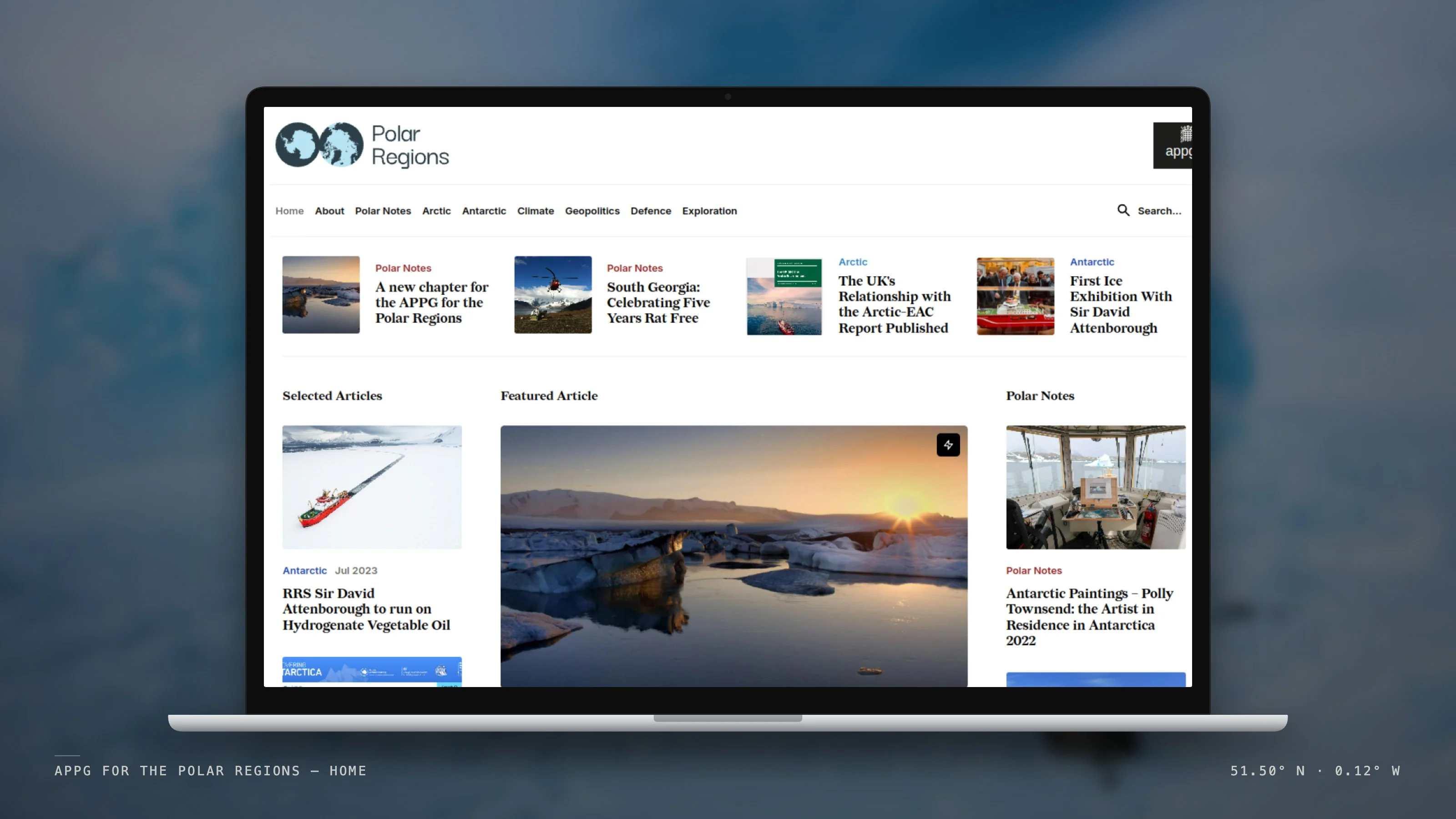
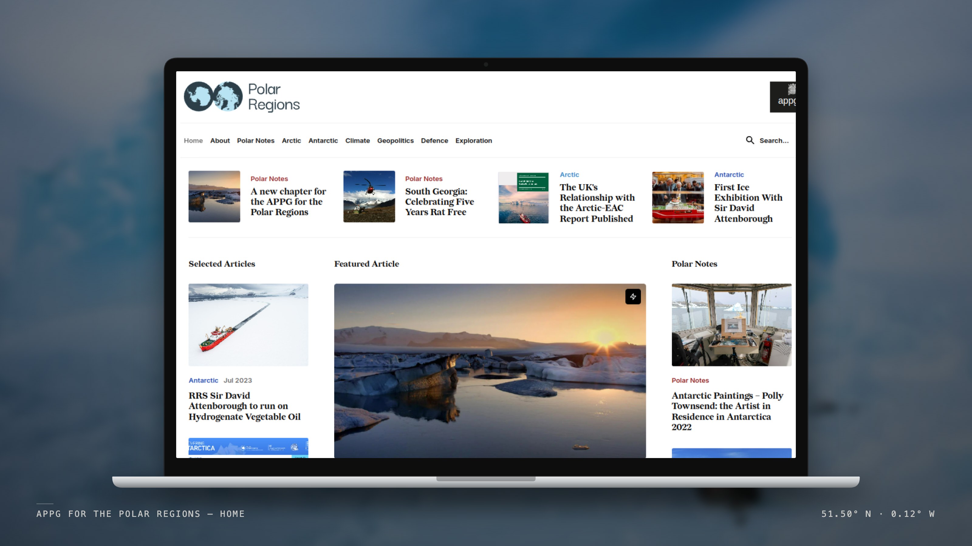
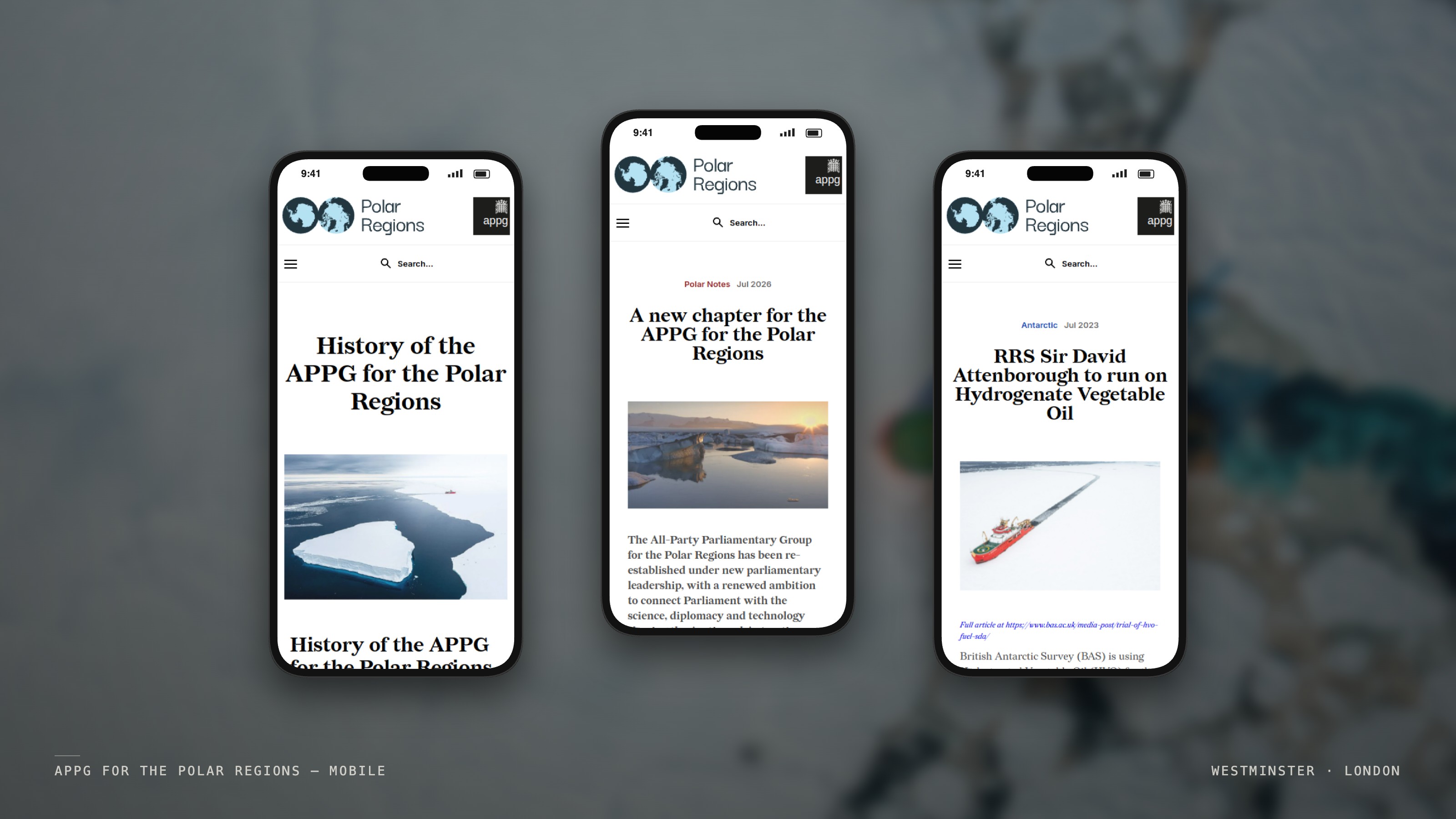
The site is built around Polar Notes and topic sections (Arctic, Antarctic, Climate, Geopolitics, Defence and Exploration), so a reader can follow a subject rather than a date.
A Webflow CMS holds posts, categories, participants and the group's history, with featured and cover-story controls for the homepage and site-wide search. Archive papers going back to 2018 sit alongside new work.
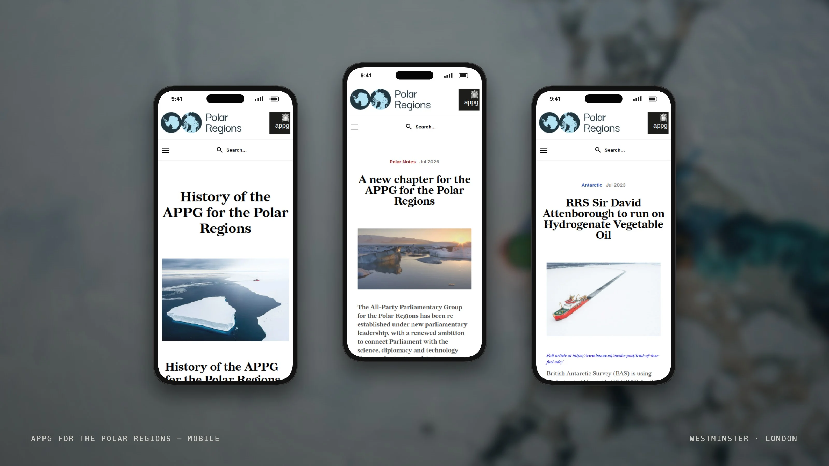
The 2026 relaunch
In 2026 the group was re-established under George Freeman MP. The site took on the new officers and, in July 2026, carried the announcement of the group's three areas of focus: polar science and planetary change; geopolitics, diplomacy and security; and technology, innovation and data.
01 — Challenge
The group's logos had been used inconsistently, and it had no single place to publish its briefings, events and news.
An APPG's membership and officers change with each Parliament. The site had to be easy to keep accurate, and credible to scientists, diplomats and parliamentarians alike.
02 — Role
- A review of the existing brand assets.
- Research into historic polar maps.
- Redesign of the APPG mark, with mono, colour, Portcullis, wide and stacked versions (December 2022).
- Colour palette, typeface and stationery.
- Webflow design and build. The site went live in January 2023.
- Editorial structure for briefings, papers and news.
- Hosting, domain and ongoing support.
- The 2026 update for the re-established group: new officers, and the relaunch announcement.
03 — Approach
The site is built around Polar Notes and topic sections (Arctic, Antarctic, Climate, Geopolitics, Defence and Exploration), so a reader can follow a subject rather than a date.
A Webflow CMS holds posts, categories, participants and the group's history, with featured and cover-story controls for the homepage and site-wide search. Archive papers going back to 2018 sit alongside new work.
Identity

04 — Outcome
The mark and the site have been the group's public face since January 2023. Because the identity comes from maps of the places themselves rather than from any one Parliament, it carried through a change of chair and the 2026 relaunch.
APPGs are informal cross-party groups. They are not official bodies of the House of Commons or the House of Lords.
Credits
Project Description
The All-Party Parliamentary Group for the Polar Regions connects MPs and Peers with the science, geopolitics and technology of the Arctic and Antarctic. Base Camp redrew its mark, built polarregions.co.uk in Webflow, and updated it when the group was re-established under George Freeman MP in 2026.
Client
APPG for the Polar Regions — Identity & Website
Date
2022–2026
Services
Identity / Website Design / Webflow / Editorial System
Sector
Parliament / Polar policy
The work. What we did, and what it changed.
The group's logos had been used inconsistently, and it had no single place to publish its briefings, events and news.
An APPG's membership and officers change with each Parliament. The site had to be easy to keep accurate, and credible to scientists, diplomats and parliamentarians alike.
- A review of the existing brand assets.
- Research into historic polar maps.
- Redesign of the APPG mark, with mono, colour, Portcullis, wide and stacked versions (December 2022).
- Colour palette, typeface and stationery.
- Webflow design and build. The site went live in January 2023.
- Editorial structure for briefings, papers and news.
- Hosting, domain and ongoing support.
- The 2026 update for the re-established group: new officers, and the relaunch announcement.
The site is built around Polar Notes and topic sections (Arctic, Antarctic, Climate, Geopolitics, Defence and Exploration), so a reader can follow a subject rather than a date.
A Webflow CMS holds posts, categories, participants and the group's history, with featured and cover-story controls for the homepage and site-wide search. Archive papers going back to 2018 sit alongside new work.
The mark and the site have been the group's public face since January 2023. Because the identity comes from maps of the places themselves rather than from any one Parliament, it carried through a change of chair and the 2026 relaunch.
APPGs are informal cross-party groups. They are not official bodies of the House of Commons or the House of Lords.
A parliamentary group's officers change with every election. The site was built so that keeping it accurate is a small job, not a project.
“The work wasn't just about making it look better — it was about building a clearer relationship between product, story and experience.”
Related Work — More from the studio. Selected projects where brand, design, and performance move as one.


Shackleton × Defender — Rally Partnership
Partnership Strategy / Concept / Production / Creative Direction
Shackleton — Made to Move
Campaign Concept / Production / Talent / Creative Direction
Shackleton — The Exploration System
Brand Strategy / Product Strategy / System Design / Creative Direction